
What is a Preschools & Daycare Centers Financial Performance Dashboard?
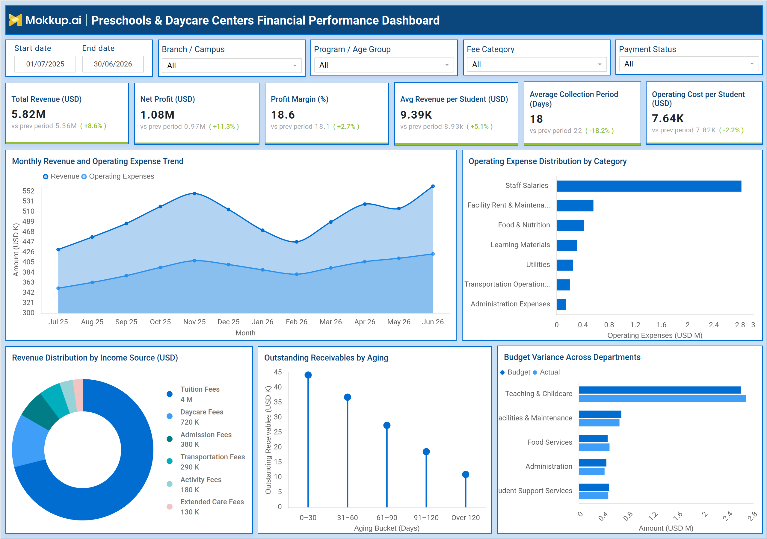
The Preschools & Daycare Centers Financial Performance Dashboard is a wireframe template built for childcare business owners, finance managers, and franchise administrators who need a clear view of how their centers are performing financially. It brings revenue, expenses, receivables, and budget data into one wireframe, making preschool financial performance tracking straightforward instead of scattered across spreadsheets. Filters for branch or campus, program or age group, fee category, and payment status let finance teams narrow the view to a specific location or program without losing the bigger financial picture. For multi-branch operators, this structure supports daycare center revenue management by showing how tuition, admission, and transportation fees contribute to income, while also surfacing where operating costs are concentrated. The dashboard gives anyone responsible for childcare business profit margin analysis a single reference point across a portfolio of centers.
How to Create a Preschools & Daycare Centers Financial Performance Dashboard
You don’t need to build your report from scratch; just start with a ready-to-use dashboard template from Mokkup. Add in your data and export it however you like. Here’s how to do it:
1. Create or Log in to Your Mokkup Account
Start by signing up on Mokkup.ai using your email. If you already have an account, just log in, and you'll be good to go.
2. Choose and Customize Your Dashboard Template
Find the Preschools & Daycare Centers Financial Performance Dashboard template in the Templates section. Use the drag-and-drop editor to adjust KPIs, edit filters, or add elements based on your data.
3. Export to Your BI Tool
Once your dashboard wireframe is ready, use the BI Tool Export feature to send it directly to Power BI or Tableau for further analysis and enhancements. You can also download the dashboard as a PDF, PNG, or JPEG, embed it on a platform, or invite your team to collaborate.
Note: This is a Pro template. You'll need a Pro subscription on Mokkup to use and customize this dashboard wireframe. Upgrade anytime to unlock full access.
Preschools & Daycare Centers Financial Performance Dashboard Example
A finance manager overseeing several preschool branches opens this dashboard at the start of a review cycle to understand how revenue and costs have moved since the last reporting period. Before looking at any single branch, they set the date range and filter by campus to check whether performance is holding steady or drifting away from targets. The starting question is simple: is each center generating enough revenue to cover its cost base, and where should attention go first? From here, the manager can identify which income sources are carrying the business and which fee categories are underperforming, using the revenue trend and income source breakdown to guide that judgment. They can track how operating expenses move alongside revenue month over month, and compare expense categories against each other to see whether staffing, facility, or food costs are growing faster than they should.
When receivables start aging beyond a comfortable window, the manager can prioritize collection efforts on the buckets carrying the most outstanding value, supporting daycare fee collection efficiency instead of chasing every overdue account equally. Department heads can also compare budgeted spend against actual spend to flag where a team is overshooting its allocation, reinforcing preschool operating expense management across the organization. Taken together, the dashboard helps finance and operations teams move from reactive reporting to proactive financial management. Instead of waiting for month-end close to discover a shortfall, teams can catch shifts in revenue mix, expense growth, or receivables aging early enough to act. Over time, this supports more disciplined childcare budgeting variance analysis and gives leadership confidence that each center's financial health is being monitored consistently.
How to Analyze Data in a Preschools & Daycare Centers Financial Performance Dashboard
Here is how you can analyze data from this dashboard:
- Filter by branch, campus, program, or age group to isolate performance for a specific center or cohort.
- Use the start and end date filters to compare financial performance across custom reporting periods.
- Track the monthly revenue and operating expense trend to spot months where costs rise faster than income.
- Break down operating expenses by category to identify the largest cost drivers, such as staff salaries.
- Review revenue distribution by income source to see how tuition and ancillary fees contribute to revenue.
- Examine outstanding receivables by aging bucket to prioritize collection on the oldest balances.
- Compare budget versus actual spend by department to support childcare budget variance analysis.
- Apply the fee category and payment status filters to focus on specific billing segments.
Benefits of a Preschools & Daycare Centers Financial Performance Dashboard
The following are the benefits of using this dashboard:
- Consolidates revenue, expense, and receivables data into one wireframe for faster financial reviews.
- Supports preschool financial performance tracking across multiple branches from a single view.
- Makes it easier to spot cost categories growing out of proportion to revenue.
- Improves daycare fee collection efficiency by highlighting aging receivables before they become write-offs.
- Helps finance teams justify decisions with clear budget-versus-actual comparisons by department.
- Reduces time spent consolidating data from separate spreadsheets or systems.
- Gives leadership a consistent format for childcare business profit margin analysis across centers.
KPIs to Track in a Preschools & Daycare Centers Financial Performance Dashboard
The following key KPIs can be tracked by using this dashboard:
- Total Revenue (USD) - measures total income generated across tuition, daycare, and ancillary fees for the selected period.
- Net Profit (USD) - shows how much revenue remains after subtracting all operating expenses.
- Profit Margin (%) - indicates what portion of revenue converts into profit, reflecting overall financial efficiency.
- Avg Revenue per Student (USD) - tracks average income generated per enrolled student, useful for pricing decisions.
- Average Collection Period (Days) - measures how long it takes on average to collect payments after fees are due.
- Operating Cost per Student (USD) - shows average operating expense per enrolled student, supporting preschool operating expense management.
Frequently Asked Questions
1. What does the Preschools & Daycare Centers Financial Performance Dashboard track?
It tracks revenue, operating expenses, net profit, receivables aging, and budget variance for preschool and daycare operations. Filters for branch, program, fee category, and payment status let teams narrow this view to a specific segment.
2. Who should use this dashboard?
Finance managers, center administrators, and franchise operators handling daycare center revenue management use this dashboard most. It also supports department heads tracking budget versus actual spend.
3. Can I customize this dashboard template for my own data?
Yes. The template can be edited in Mokkup's drag-and-drop editor to adjust KPIs, filters, and chart layouts based on your own centers' data before exporting it to your BI tool.