
What is a Preschools & Daycare Centers Executive Performance Dashboard?
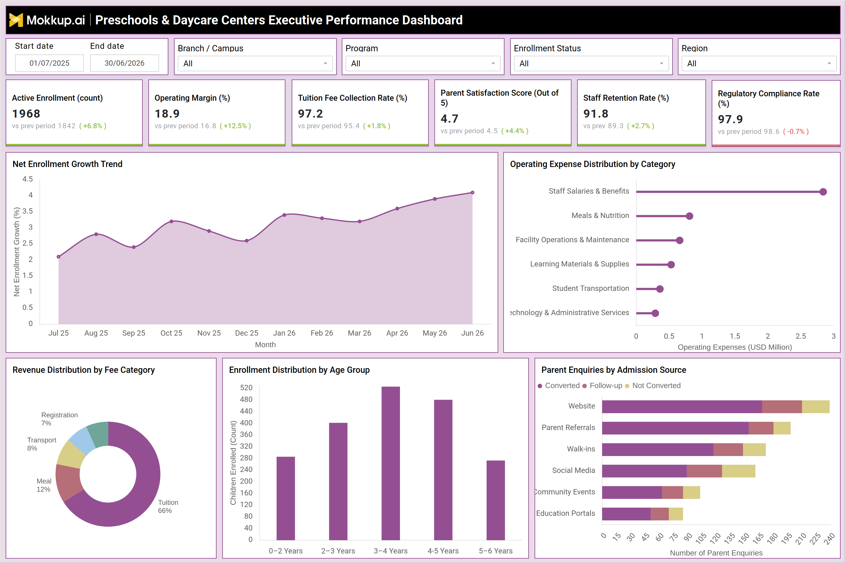
The Preschools & Daycare Centers Executive Performance Dashboard is a preschool executive performance dashboard template built for owners, regional directors, and operations leaders who manage multiple branches or campuses. It brings enrollment, revenue, cost, staff, and compliance data into a single view so leadership does not have to pull separate reports from admissions systems, billing platforms, and HR tools. With filters for date range, branch or campus, program, enrollment status, and region, the dashboard lets executives narrow their view to a single location or compare performance across an entire network. As a daycare center enrollment tracking dashboard, it is designed to answer the questions that matter most to leadership: is enrollment growing, is tuition being collected on schedule, are parents satisfied, and is the organization staying compliant with regulatory requirements? Built on Mokkup, this dashboard template can be customized and exported to Power BI or Tableau, making it a practical preschool dashboard template for Power BI and Tableau teams that need a starting wireframe rather than a blank canvas.
How to Create a Preschools & Daycare Centers Executive Performance Dashboard
You don't need to build your report from scratch, just start with a ready-to-use dashboard template from Mokkup. Add in your data and export it however you like. Here's how to do it:
1. Create or Log in to Your Mokkup Account
Start by signing up on Mokkup.ai using your email. If you already have an account, just log in, and you'll be good to go.
2. Choose and Customize Your Dashboard Template
Find the Preschools & Daycare Centers Executive Performance Dashboard template in the Templates section. Use the drag-and-drop editor to adjust KPIs, edit filters, or add elements based on your data.
3. Export to Your BI Tool
Once your dashboard wireframe is ready, use the BI Tool Export feature to send it directly to Power BI or Tableau for further analysis and enhancements. You can also download the dashboard as a PDF, PNG, or JPEG, embed it on a platform, or invite your team to collaborate.
Note: This is a Pro template. You'll need a Pro subscription on Mokkup to use and customize this dashboard wireframe. Upgrade anytime to unlock full access.
Preschools & Daycare Centers Executive Performance Dashboard Example
A preschool network director opens this dashboard at the start of a review cycle to understand how each campus is performing against enrollment and financial targets. Instead of chasing individual center managers for updates, the director uses the branch, program, and region filters to isolate a specific location or view the network as a whole and quickly identifies which campuses are ahead of plan and which need attention. From here, finance and operations leaders can track whether tuition collection is keeping pace with enrollment growth, and whether operating margin is improving or under pressure from rising costs, using this preschool operating margin and tuition fee collection dashboard to keep both metrics in view together.
By reviewing how operating expenses break down across staff salaries, meals, facility upkeep, learning materials, transportation, and technology, leaders can pinpoint where costs are concentrated and where efficiency initiatives might have the greatest impact. Enrollment planners can also compare how children are distributed across age groups to anticipate staffing and classroom needs for the term ahead. Marketing and admissions teams use the dashboard to evaluate which enquiry sources convert best, comparing website leads, parent referrals, walk-ins, social media, community events, and education portals to decide where to invest outreach budget. Revenue teams can also see how income breaks down across tuition, registration, meals, and transport fees to judge how diversified revenue really is.
Taken together, the dashboard helps preschool and daycare leadership move from scattered spreadsheets to a single source of truth, allowing them to act on enrollment trends, protect margins, keep staff retention strong, and maintain the regulatory compliance that families and licensing bodies expect.
How to Analyze Data in a Preschools & Daycare Centers Executive Performance Dashboard
Here is how you can analyze data from this dashboard:
- Filter by branch, campus, or region in this daycare center enrollment tracking dashboard to compare performance across locations before reviewing the network as a whole.
- Set a date range to evaluate enrollment and financial trends over a specific term or fiscal year.
- Review the Net Enrollment Growth Trend to spot months where enrollment accelerated or slowed.
- Compare Operating Expense Distribution by Category to identify which cost centers consume the largest share of budget.
- Use Revenue Distribution by Fee Category to check dependence on tuition versus meals, transport, and registration fees.
- Break down Enrollment Distribution by Age Group to plan classroom capacity and staffing ratios.
- Analyze Parent Enquiries by Admission Source to see which channels convert enquiries into enrollments most efficiently.
- Use this childcare kpi dashboard for daycare centers to cross-check KPI tiles against prior-period comparisons.
Benefits of a Preschools & Daycare Centers Executive Performance Dashboard
The following are the benefits of using this dashboard:
- Consolidates enrollment, financial, staffing, and compliance data into one preschool operating margin and tuition fee collection dashboard, avoiding manual reporting.
- Helps executives compare performance across branches, campuses, or regions without building separate reports for each location.
- Surfaces cost distribution across categories, making it easier to control expenses and protect operating margin.
- Highlights which admission sources deliver the highest conversion, guiding smarter marketing spend.
- Tracks staff retention and parent satisfaction alongside financial metrics in a daycare staff retention and parent satisfaction dashboard, giving a balanced view of operational health.
- Supports faster, evidence-based decisions during budget reviews and board reporting.
- Can be customized and exported to Power BI or Tableau, fitting into existing BI workflows.
KPIs to Track in a Preschools & Daycare Centers Executive Performance Dashboard
The following key KPIs can be tracked by using this dashboard:
- Key Performance Indicators (KPIs) are measurable metrics that show whether an organization is meeting its goals. In this childcare kpi dashboard for daycare centers, the KPIs below give leadership a clear read on performance.
- Active Enrollment (count) — measures the total number of children currently enrolled, indicating overall demand and capacity utilization.
- Operating Margin (%) — shows the percentage of revenue remaining after operating costs, reflecting overall financial health.
- Tuition Fee Collection Rate (%) — tracks how much of billed tuition is actually collected, signaling billing efficiency and cash flow reliability.
- Parent Satisfaction Score (out of 5) — captures how satisfied parents are with the center's services, a leading indicator of retention and referrals.
- Staff Retention Rate (%) — a core measure in any daycare staff retention and parent satisfaction dashboard, this KPI tracks the share of staff retained over a period, reflecting workplace stability and hiring pressure.
- Regulatory Compliance Rate (%) — indicates how closely the organization adheres to licensing and regulatory requirements, protecting accreditation and reputation.
Frequently Asked Questions
1. What does the Preschools & Daycare Centers Executive Performance Dashboard track?
The Preschools & Daycare Centers Executive Performance Dashboard is a preschool executive performance dashboard template that tracks enrollment, revenue, operating costs, staff retention, parent satisfaction, and regulatory compliance. Filters for branch, program, enrollment status, and region let leadership view performance at the network or individual campus level.
2. Who should use this dashboard?
This dashboard is built for preschool and daycare executives, regional directors, and operations leaders who oversee multiple campuses. It also works well as a childcare kpi dashboard for daycare centers used by finance and admissions teams.
3. Can this dashboard template be exported to other BI tools?
Yes. As a preschool dashboard template for power bi and tableau, it can be customized in Mokkup and then exported directly to Power BI or Tableau, or downloaded as a PDF, PNG, or JPEG.