What is a Neurology Staff Utilization Dashboard?
A Neurology Staff Utilization Dashboard is a specialized HR analytics template for neurology clinics to track and optimize staff performance and resource allocation. It includes multiple workforce metrics into a single interactive interface, including patient-to-neurologist ratios, turnover rates, overtime hours, training completion, and employee satisfaction. This dashboard wireframe helps decision-makers assess staffing adequacy, understand workforce trends, and plan recruitment or redistribution strategies.
The dashboard wireframe also highlights compliance metrics like license and certification status, ensuring regulatory standards are maintained. It turns complex HR data into actionable insights, improving operational efficiency and patient care quality in neurology clinics.
How to Create a Neurology Staff Utilization Dashboard
You don’t need to build your report from scratch—just start with a ready-to-use Neurology Staff Utilization dashboard template from Mokkup. Add in your data and export it however you like. Here’s how to do it:
1. Create or Log in to Your Mokkup Account
Start by signing up on Mokkup.ai using your email. If you already have an account, just log in, and you’ll be good to go.
2. Choose and Customize Your Dashboard Template
Find the Neurology Staff Utilization Dashboard template in the Templates section. Use the drag-and-drop editor to adjust KPIs, edit filters, or add elements based on your data.
3. Export to Your BI Tool
Once your dashboard wireframe is ready, use the BI Tool Export feature to send it directly to Power BI or Tableau for further analysis and enhancements. You can also download the dashboard as a PDF, PNG, or JPEG, embed it on a platform, or invite your team to collaborate.
Note: This is a Pro template. You’ll need a Pro subscription on Mokkup to use and customize this dashboard wireframe. Upgrade anytime to unlock full access.
Neurology Staff Utilization Dashboard Example
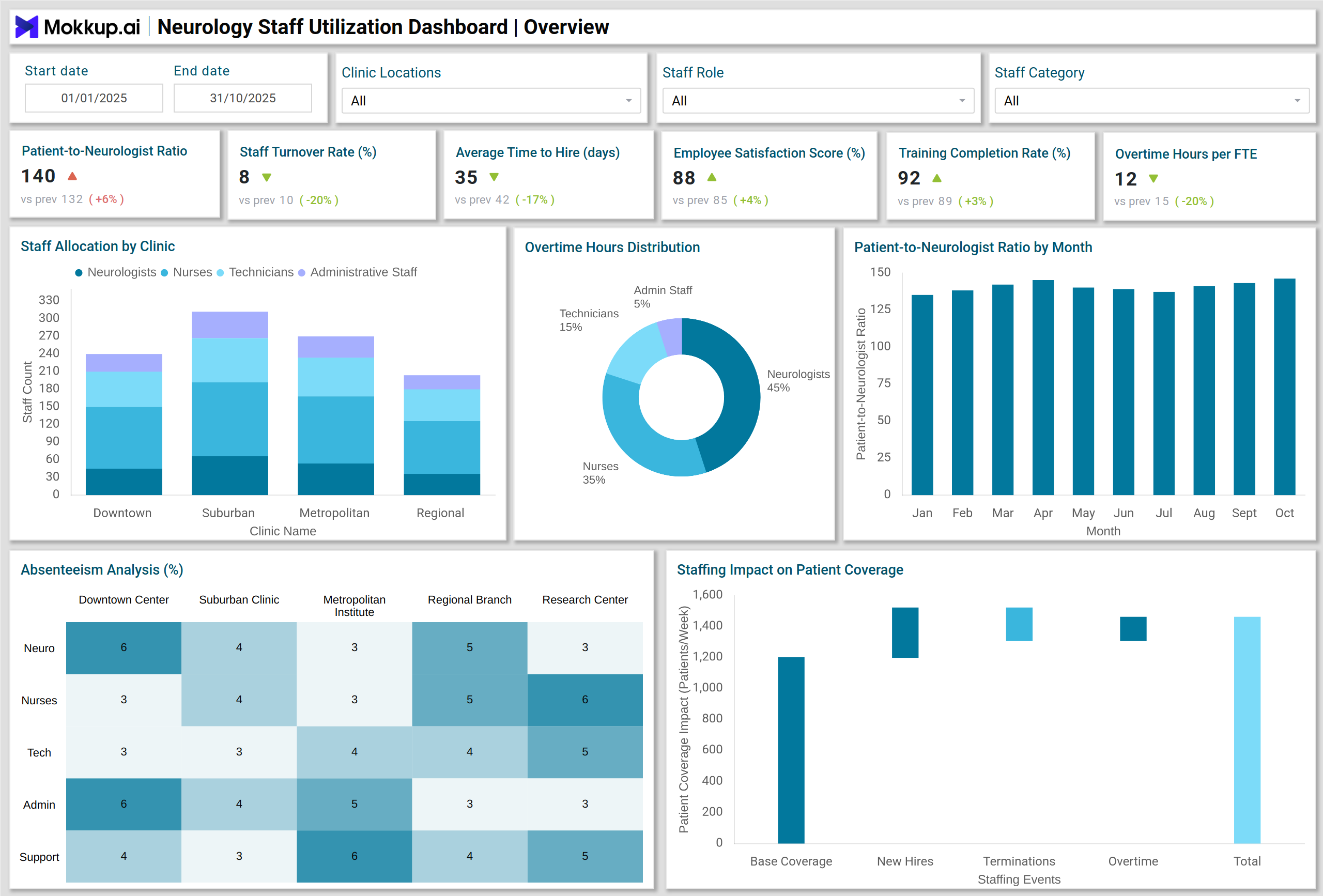
A typical Neurology Staff Utilization Dashboard includes a combination of KPI cards, charts, and visual analytics that provide a holistic view of staff performance. For instance, KPI Cards display metrics such as patient-to-neurologist ratio, staff turnover rate, average time-to-hire, employee satisfaction, and training completion rates. Stacked Column Charts illustrate staff allocation by role across multiple clinics, helping managers identify imbalances. Column Charts track trends like patient-to-neurologist ratio over time, giving a clear view of workload distribution.
Pie and Donut Charts highlight overtime hours by staff category and turnover reasons, facilitating focused intervention. Heatmaps show absenteeism and sick leave rates by clinic and role, helping identify problem areas. Waterfall Charts demonstrate the impact of staffing changes on patient coverage, while Sankey Charts visualize staff movement across clinics. This dashboard template allows HR and operations teams to monitor multiple clinics simultaneously, analyze workforce efficiency, and make data-driven decisions to improve both staff satisfaction and patient outcomes.
How to Analyze Data in Neurology Staff Utilization Dashboards
Neurology staff utilization dashboards help hospitals monitor workforce performance, optimize staffing, and maintain high-quality patient care. By analyzing trends in workload, training, and turnover, administrators can make informed HR and operational decisions:
- Compare Trends: Monitor patient-to-neurologist ratios and overtime hours across months to identify workload spikes or staffing gaps.
- Identify Risk Areas: Use heatmaps for sick leave and absenteeism to pinpoint clinics or roles with high absenteeism.
- Evaluate Recruitment Efficiency: Funnel charts help track the time-to-hire and conversion rates in the recruitment pipeline.
- Assess Training Compliance: Bar charts showing training completion by staff category ensure compliance and skill readiness.
- Understand Turnover Drivers: Donut charts with turnover reasons allow HR to implement targeted retention strategies.
- Measure Impact of Staffing Changes: Waterfall charts show how adding or reassigning staff affects patient coverage.
- Track Staff Movement: Sankey charts visualize staff movement across clinics, helping optimize workforce distribution.
Benefits of Neurology Staff Utilization Dashboards
A neurology staff utilization dashboard provides actionable insights to improve operational efficiency, staff satisfaction, and patient care quality:
- Enhanced Resource Allocation: Efficiently allocate neurologists and support staff to match patient demand.
- Reduced Turnover: Identify and address causes of staff attrition to retain experienced employees.
- Improved Operational Efficiency: Monitor overtime, absenteeism, and training to optimize workforce performance.
- Data-Driven HR Decisions: Use real-time analytics to make informed decisions on recruitment, staffing, and training.
- Regulatory Compliance: Track certifications and licenses to ensure staff meet regulatory requirements.
- Patient Care Optimization: By managing staff availability and performance, patient satisfaction and treatment quality improve.
KPIs to Track in Neurology Staff Utilization Dashboards
Tracking these KPIs ensures balanced workloads, high retention, and efficient workforce management:
- Patient-to-Neurologist Ratio: Ensures optimal workload distribution.
- Staff Turnover Rate (%): Monitors retention and attrition trends.
- Average Time to Hire (Days): Measures recruitment efficiency.
- Employee Satisfaction Score (%): Gauge staff engagement and morale.
- Training Completion Rate (%): Track mandatory training and upskilling.
- Overtime Hours per FTE (Monthly): Identify overworked staff and redistribute workload.
- Vacancy Rate (%): Track unfilled positions and potential resource gaps.
Frequently Asked Questions
Q1. Who can benefit from the Neurology Staff Utilization Dashboard?
HR directors, operations managers, and clinic administrators can leverage this dashboard to optimize workforce allocation and monitor staff performance.
Q2. How often should the dashboard be updated?
Ideally, updates should be made at least daily to ensure accurate monitoring of staffing trends and metrics.
Q3. What types of visualizations are most useful?
Stacked columns, pie and donut charts, heatmaps, waterfall charts, funnel charts, and Sankey charts are highly effective for analyzing staff utilization and trends.
Q4. Does this dashboard support compliance tracking?
Yes. It tracks licenses, certifications, and training completion, helping clinics maintain regulatory compliance.