The network usage report dashboard template offers an in-depth, data-driven overview of telecom customer behavior and network performance metrics. With this tool, telecom providers can closely monitor user activity across various regions, identify usage trends, and track key performance indicators such as bandwidth consumption, peak usage times, and network reliability. By providing real-time insights, the dashboard enables providers to make data-backed decisions to optimize resource allocation, prevent network congestion, and enhance overall service efficiency.
It is divided into two main screens: Summary and Network Performance.
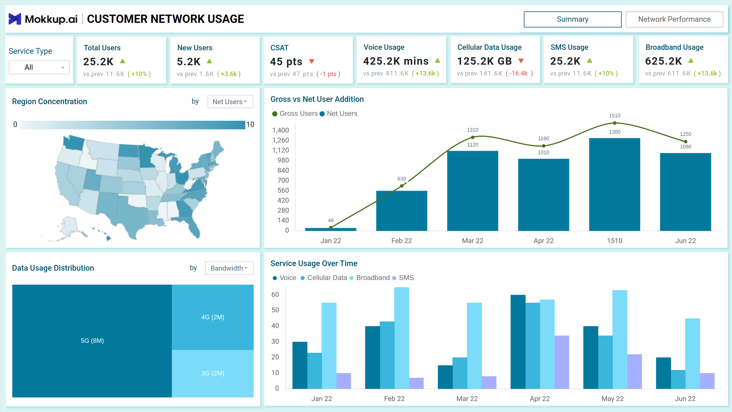
Summary
The Summary screen provides a high-level view of customer metrics, focusing on usage patterns, user additions, and satisfaction levels. It empowers telecom providers to make informed decisions based on real-time data.
Key Terms to Know
- Total Users : Displays the current total user base with percentage change compared to the previous period . Helps monitor user growth.
- CSAT (Customer Satisfaction Score): The score reflects user satisfaction with the service. A decrease highlights areas needing improvement..
- Region Concentration Map: Visualizes user distribution across regions. Darker shades represent higher user concentration, aiding in identifying high-demand areas for resource allocation.
- Gross vs. Net User Addition Chart: A bar and line graph displaying the number of gross and net user additions over time, allowing providers to evaluate user retention rates and acquisition trends.
- Data Usage Distribution Treemap: Segments data usage by technology (e.g., 5G, 4G, 3G). The size of each block represents its share, providing insights into bandwidth demand and network upgrades.
- Service Usage Over Time: A bar chart showcasing trends across different services (Voice, Cellular Data, Broadband, SMS) for selected months. Enables providers to identify peak demand periods.
Network Performance
The Network Performance screen offers a deeper dive into network reliability, user issues, and performance patterns to improve service quality and address complaints.
Key Terms to Know
- Average Data Usage: Tracks per-user data consumption trends. Useful for network capacity planning.
- Call Drop Rate: A critical metric for assessing network reliability. Higher rates signal a need for improvement.
- Complaint Reports by Issue: A stacked bar chart categorizing complaints by network, device, and billing issues. Helps providers pinpoint problem areas during peak times.
- Complaints by Status Pie Chart: Shows the percentage of open, in-progress, and resolving complaints. Ensures resolution prioritization.
- First Contact Resolution Rate: A gauge chart highlighting the efficiency of the first-line support team.
- Usage During the Day (Heatmap): Displays hourly activity across services (Data, Voice, SMS, WiFi). Darker shades indicate higher usage, identifying peak traffic hours for load balancing.
- Call Drop vs. Availability Rate Line Chart: This line chart visualizes the relationship between call drop rates and availability percentages, revealing performance bottlenecks.
- Service Type Filter: Allows users to toggle between different services like Voice, Cellular Data, Broadband, and SMS. This helps analyze service-specific trends and identify high-demand areas.
- Region Filter: This feature enables users to view metrics specific to geographic locations, aiding in regional performance analysis and targeted resource allocation.
- Time Period Selection: Users can adjust the time range to analyze data trends for a specific month, quarter, or year, supporting both short-term monitoring and long-term planning.
Dashboard Template Insights
This dashboard wireframe enables telecom providers to:
- Real-time data on user additions, activity patterns, and data usage helps businesses understand behavior more effectively.
- Regional demand visibility and peak period tracking ensures optimal allocation of network resources for improved efficiency.
- Metrics like CSAT, complaint volumes, and resolution rates empower teams to enhance customer satisfaction through targeted improvements.
Conclusion
This dashboard offers a dual-screen overview of user activity and network performance. It empowers telecom providers with actionable insights to improve customer experience, boost operational efficiency, and drive business growth.