
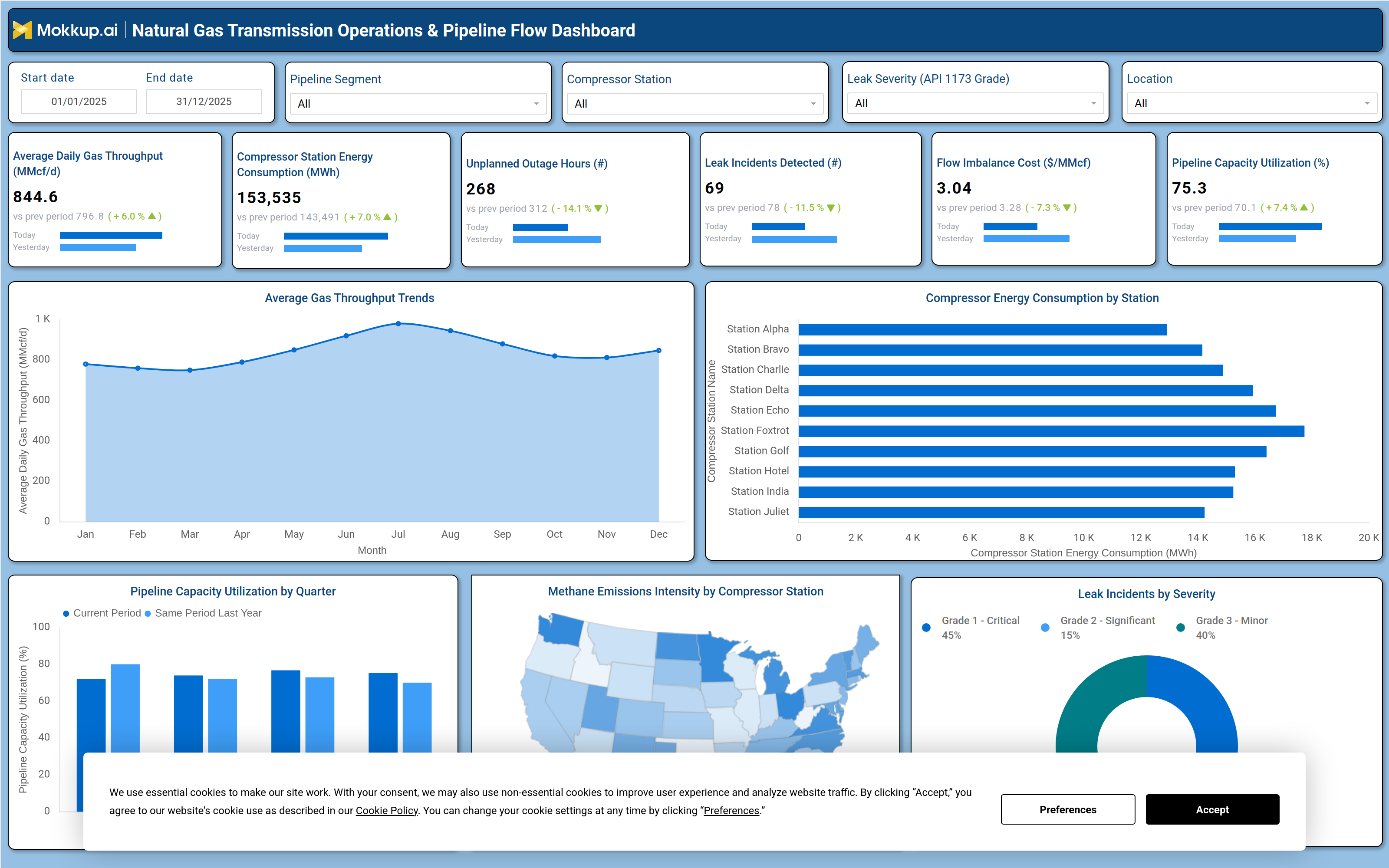
What is a Natural Gas Transmission Operations & Pipeline Flow Dashboard?
The Natural Gas Transmission Operations & Pipeline Flow Dashboard is a wireframe template built for pipeline operators, compressor station managers, and transmission planners who need one view of throughput, energy consumption, and safety performance across a gas transmission network. As a natural gas transmission operations dashboard, it consolidates daily flow volumes, compressor station energy use, outage hours, and leak detection data so operations teams can move between segments, stations, and time periods without switching between separate reports. The layout groups filters for pipeline segment, compressor station, leak severity grade, and location above a row of headline metric tiles, followed by trend and comparison charts that support pipeline capacity utilization analysis alongside daily flow monitoring. Built on the Mokkup wireframe platform, the template can be customized with a company's own data and exported to a preferred BI tool for deeper analysis.
How to Create a Natural Gas Transmission Operations & Pipeline Flow Dashboard
You don't need to build your report from scratch, just start with a ready-to-use dashboard template from Mokkup. Add in your data and export it however you like. Here's how to do it:
1. Create or Log in to Your Mokkup Account
Start by signing up on Mokkup.ai using your email. If you already have an account, just log in, and you'll be good to go.
2. Choose and Customize Your Dashboard Template
Find the Natural Gas Transmission Operations & Pipeline Flow Dashboard template in the Templates section. Use the drag-and-drop editor to adjust KPIs, edit filters, or add elements based on your data.
3. Export to Your BI Tool
Once your dashboard wireframe is ready, use the BI Tool Export feature to send it directly to Power BI or Tableau for further analysis and enhancements. You can also download the dashboard as a PDF, PNG, or JPEG, embed it on a platform, or invite your team to collaborate.
Note: This is a Pro template. You'll need a Pro subscription on Mokkup to use and customize this dashboard wireframe. Upgrade anytime to unlock full access.
Natural Gas Transmission Operations & Pipeline Flow Dashboard Example
A pipeline operations manager typically opens this natural gas transmission operations dashboard at the start of a shift to understand how gas is moving across the network and whether any compressor station is showing signs of stress. Using the filters for pipeline segment, compressor station, leak severity grade, and location, the manager narrows the view to a specific corridor or facility before deciding where to focus attention for the day. The question driving this session is simple: Is throughput holding steady, and is any part of the network trending toward an outage or a safety event?
From there, the manager scans the top metric row to gauge whether gas volumes, energy draw, and imbalance cost are moving in a healthy direction compared with the prior period, then checks the throughput trend chart to see if the current month lines up with seasonal patterns or signals a genuine shift in demand. Used as a pipeline flow monitoring dashboard template, the screen lets planners compare compressor energy consumption station by station to identify which facilities are running hotter than their peers, supporting tracking of compressor station energy consumption and prioritizing those stations for closer maintenance review. The leak incident breakdown by severity helps safety leads determine whether critical-grade incidents are being resolved quickly and serves as a leak incident severity-tracking dashboard that holds response protocols accountable.
Taken together, the dashboard helps transmission teams move from reactive troubleshooting to proactive network management, spotting stress points before they become outages, holding compressor stations accountable for energy efficiency, and keeping leak response times aligned with regulatory expectations. Reviewing pipeline capacity utilization analysis by quarter also lets planners judge whether capacity gains are seasonal or sustained, feeding that judgment directly into upcoming maintenance and capital planning conversations.
How to Analyze Data in a Natural Gas Transmission Operations & Pipeline Flow Dashboard
Here is how you can analyze data from this dashboard:
- Filter by pipeline segment, compressor station, leak severity grade, or location to isolate the network area under review.
- Compare Daily Gas Throughput and Pipeline Capacity Utilization against the previous period to spot early volume or efficiency shifts.
- Review the Average Gas Throughput Trends chart to separate seasonal patterns from genuine demand changes.
- Rank compressor stations on the Compressor Energy Consumption by Station chart as part of routine compressor station energy consumption tracking.
- Cross-check Leak Incidents Detected against the Leak Incidents by Severity breakdown to prioritize critical-grade cases first.
- Use the Methane Emissions Intensity map as a methane emissions intensity monitoring tool to compare station-level emissions across regions.
- Track Pipeline Capacity Utilization by Quarter against the same period last year to separate seasonal swings from structural capacity change.
Benefits of a Natural Gas Transmission Operations & Pipeline Flow Dashboard
The following are the benefits of using this dashboard:
- Centralizes throughput, energy, cost, and safety metrics into one operations dashboard, cutting time spent switching between reports.
- Functions as a methane emissions intensity monitoring tool that helps teams target station-level reduction efforts.
- Surfaces underperforming compressor stations early, helping teams prioritize maintenance before problems escalate.
- Groups leak data by severity grade in a leak incident severity tracking dashboard view so safety teams act on critical incidents first.
- Compares current and prior-period values on every KPI tile, making trend direction immediately clear.
- Built as a customizable wireframe template, letting teams adapt filters and layout before exporting to Power BI or Tableau.
KPIs to Track in a Natural Gas Transmission Operations & Pipeline Flow Dashboard
The following key KPIs can be tracked by using this dashboard:
- Average Daily Gas Throughput (MMcf/d) — measures the volume of gas moving through the network each day, indicating overall network activity.
- Compressor Station Energy Consumption (MWh) — tracks energy draw per station, the core metric behind compressor station energy consumption tracking.
- Unplanned Outage Hours (count) — counts hours lost to unplanned outages, signaling reliability gaps in the transmission network.
- Leak Incidents Detected (#) — totals leak events identified across the network, the base figure behind the leak incident severity tracking dashboard view.
- Flow Imbalance Cost ($/MMcf) — quantifies the cost impact of imbalances between scheduled and delivered gas volumes.
- Pipeline Capacity Utilization (%) — shows how much of available pipeline capacity is being used, central to pipeline capacity utilization analysis and expansion planning.
- Methane Emissions Intensity — measures methane emissions relative to gas volume transported, flagging leaks and supporting regulatory/ESG compliance tracking.
Frequently Asked Questions
1. What is the Natural Gas Transmission Operations & Pipeline Flow Dashboard used for?
It is used to monitor gas throughput, compressor station energy consumption, and leak safety performance across a transmission network in one screen. Operations and safety teams rely on it for daily monitoring and quarterly capacity reviews.
2. Can I customize this dashboard template with my own data?
Yes. Built as a pipeline flow monitoring dashboard template, it uses Mokkup's drag-and-drop editor so you can adjust KPIs, filters, and chart data to match your own pipeline network before exporting.
3. Which KPIs should pipeline operations teams track most closely?
Daily Gas Throughput, Pipeline Capacity Utilization, and Leak Incidents Detected are the core KPIs, since they capture volume, efficiency, and safety in one view. Reviewing them together helps teams catch inefficiencies before they escalate into outages.