What is a Lesson Planning & Coverage Dashboard?
A Lesson Planning & Coverage Dashboard is a curriculum planning tool and real-time lesson planner dashboard designed for educators and school administrators. It provides a centralized view of instructional progress by tracking key metrics such as Curriculum Alignment %, Topics Covered vs. Planned, Pacing Charts, and Gaps in Instruction. By consolidating this data in one platform, schools can ensure lessons stay aligned with curriculum standards, spot pacing issues early, and address instructional gaps proactively. This dashboard helps educators maintain teaching consistency, support curriculum compliance, and improve student learning outcomes.
How to Create a Lesson Planning & Coverage Dashboard
You don’t need to build your report from scratch—just start with a ready-to-use Lesson Planning dashboard template from Mokkup. Add in your data and export it however you like. Here’s how to do it:
1. Create or Log in to Your Mokkup Account
Start by signing up on Mokkup.ai using your email. If you already have an account, just log in, and you’ll be good to go.
2. Choose and Customize Your Dashboard Template
Find the Lesson planning dashboard template in the Templates section. Use the drag-and-drop editor to adjust KPIs, edit filters, or add elements based on your data.
3. Export to Your BI Tool
Once your dashboard wireframe is ready, use the BI Tool Export feature to send it directly to Power BI or Tableau for further analysis and enhancements. You can also download the dashboard as a PDF, PNG, or JPEG, embed it on a platform, or invite your team to collaborate.
Note: This is a Pro template. You’ll need a Pro subscription on Mokkup to use and customize this dashboard wireframe. Upgrade anytime to unlock full access.
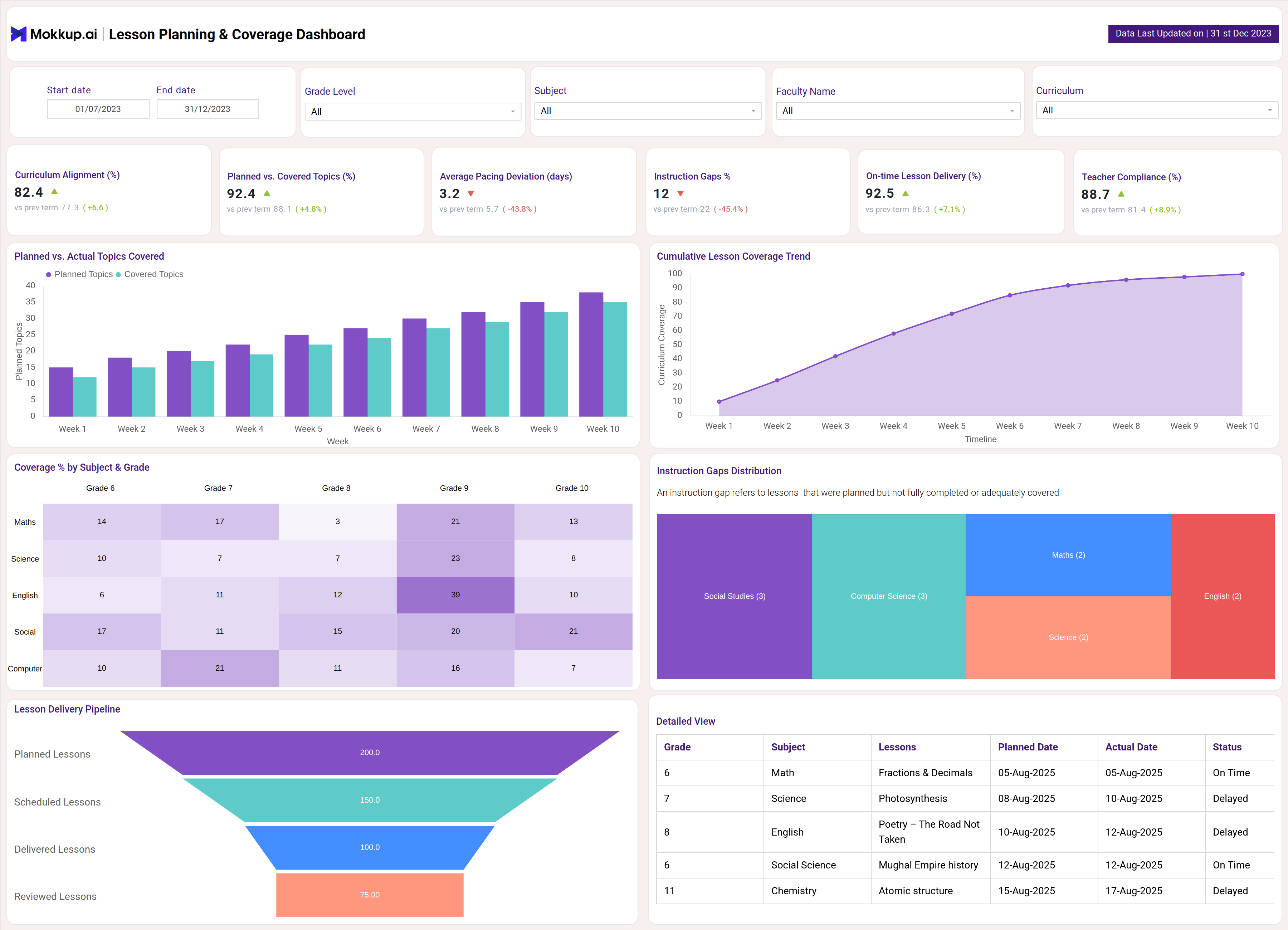
Lesson Planning & Coverage Dashboard Example
Create your personalized Lesson planning and coverage dashboard, bringing all of your metrics into one structured view. The Mokkup Lesson planning Dashboard wireframe includes visualizations such as curriculum alignment %, topics covered vs. planned, pacing charts, gaps in instruction, and more. Filters for subjects, date, and grade level allow users to tailor analysis to specific needs. Once the data is added, this dashboard can be exported to BI tools like Power BI or Tableau for deeper analysis, making it a practical solution for utilities seeking to improve efficiency and reliability.
How to Analyze Data in Lesson Planning & Coverage Dashboards
To make the most of a Lesson Planning & Coverage Dashboard, follow these steps:
- Review Curriculum Alignment % to check how closely lesson delivery matches the planned curriculum standards.
- Track Topics Covered vs. Planned to identify gaps in lesson delivery and adjust pacing as needed.
- Use Pacing Charts to monitor whether lessons are progressing on schedule or falling behind.
- Analyze Instructional Gaps to spot areas where teaching coverage is incomplete and take corrective steps.
- Monitor Training and Lesson Delivery Consistency to ensure all teachers and classrooms maintain aligned progress.
- Compare Performance Across Grades or Subjects to identify strengths, weaknesses, and areas requiring support.
- Benchmark Current Coverage Against Previous Terms to evaluate improvements in lesson planning and delivery over time.
By analyzing data this way, educators and administrators can strengthen curriculum compliance, ensure timely lesson coverage, and improve overall student learning outcomes.
Benefits of Lesson Planning & Coverage Dashboards
A Lesson Planning & Coverage Dashboard provides several advantages for schools and educators:
- Centralized Tracking: Monitor curriculum alignment, lesson coverage, and pacing in one place.
- Spot Gaps Early: Identify instructional gaps quickly to enable timely intervention.
- Boost Accountability: Increase transparency in lesson scheduling and delivery.
- Optimize Instruction: Track on-time completion, compliance, and deviations for better planning.
- Simplify Reporting: Automate reports to ease administration and compliance audits.
- Data-Driven Teaching: Use insights to enhance teaching effectiveness and improve learning outcomes.
KPIs to Track in Lesson Planning & Coverage Dashboards
A strong Lesson planning Dashboard tracks key KPIs, including:
- Curriculum Alignment (%) : Measures how closely lesson delivery matches curriculum goals
- Planned vs. Covered Topics : Tracks lessons planned versus actually taught
- Average Pacing Deviation (days) :Shows if lesson delivery is ahead or behind schedule
- Instruction Gaps : Number of topics missed or lessons not covered
- On-time Lesson Delivery (%) : Percentage of lessons delivered as scheduled
- Faculty Compliance (%) : Proportion of staff following planned instructional workflows.
By monitoring these KPIs, schools can maintain curriculum alignment, enhance teaching consistency, and improve student learning outcomes.
Frequently Asked Questions
1. Why is a Lesson Planning & Coverage Dashboard important?
A Lesson Planning & Coverage Dashboard is important because it provides real-time visibility into curriculum alignment, lesson delivery, and pacing. It helps educators and administrators ensure lessons stay on track, identify gaps early, and improve teaching effectiveness.
2. What KPIs should be included in a Lesson Planning & Coverage Dashboard?
The most important KPIs include Curriculum Alignment (%), Topics Covered vs. Planned, Pacing Charts, Instructional Gaps, and Lesson Completion Rates. These metrics give a complete view of curriculum compliance, instructional progress, and teaching consistency.
3. Can this dashboard support proactive curriculum management?
Yes. The dashboard highlights pacing issues, instructional gaps, and curriculum deviations in real time. This allows schools to take corrective action early, improve lesson coverage, and enhance student learning outcomes.