
What is a Laboratory Testing Insights Dashboard?
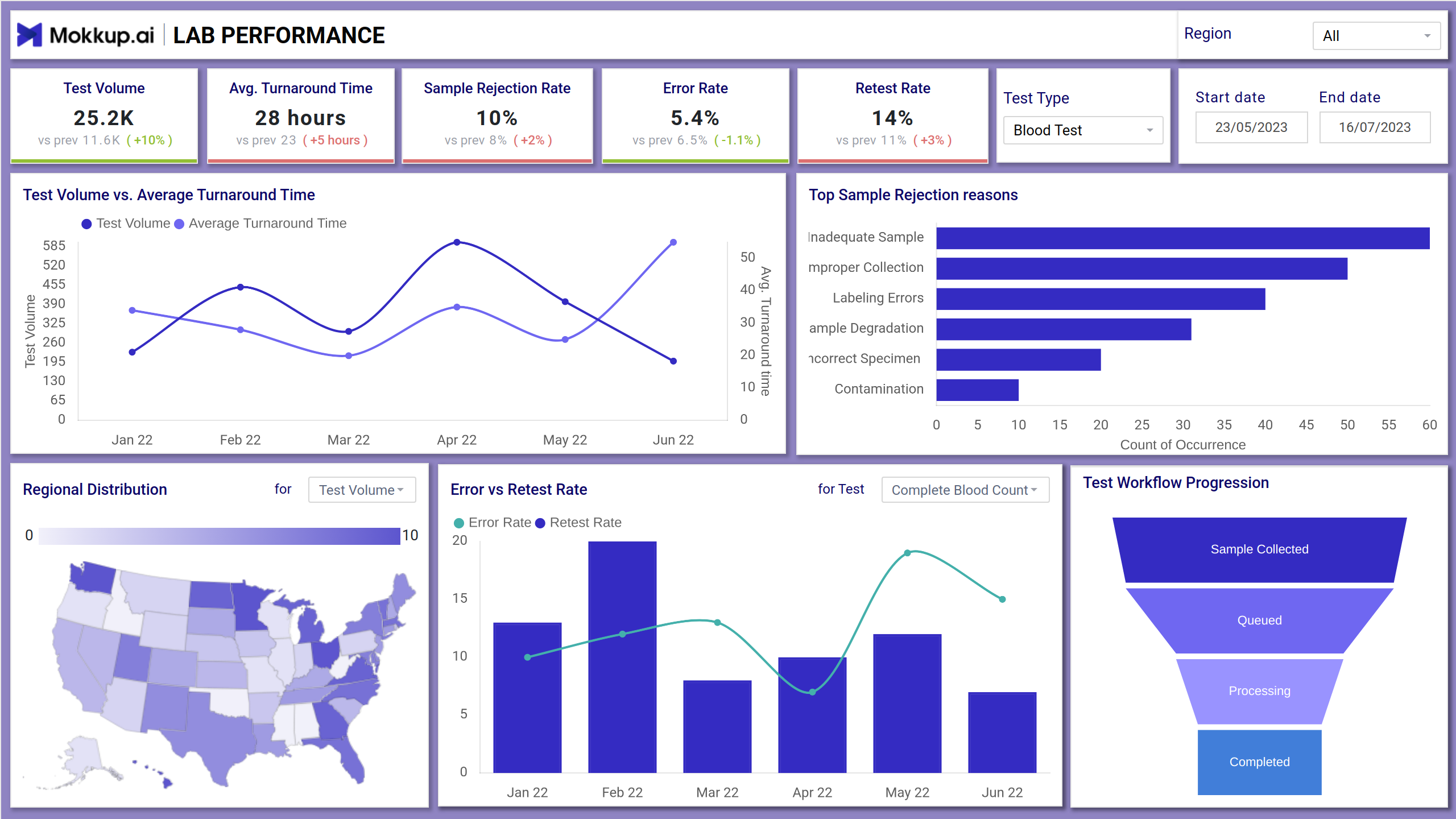
The Laboratory Testing dashboard template provides a comprehensive overview of key laboratory metrics, enabling administrators to monitor and improve operational efficiency. The dashboard wireframe offers lab efficiency and turnaround tracking through KPIs like test volume, turnaround times, sample rejection rates, and error rates, offering actionable insights through intuitive visualizations.
Laboratory Dashboard Example
This intuitive centralized lab test results tracker involves clean navigation filters that allow users to narrow down and focus on relevant data quickly. The dashboard template presents key metrics through clean visuals like KPI tiles (for turnaround time, test volumes, and error rates), bar and line charts (for trends), and funnel charts (for workflow progression). It can be used for getting patient imaging insights by tracking sample progress, and analyzing testing outcomes in real time.
How to Analyze Data in Laboratory Dashboards
Analyzing data in this medical test results dashboard involves close monitoring of major KPIs to ensure high-quality outcomes. For instance, the sample rejection rate and retest rate highlight issues in sample collection or quality control, and the error rate flags inaccuracies in test execution or data entry. Dashboards often break down top sample rejection reasons, such as insufficient volume, contamination, or labeling errors, allowing labs to implement targeted corrective actions. You can begin by drilling down into the preferred test type, data range, or region to get the right insights for continuous quality improvement in laboratory operations.
How to Create a Lab Testing Dashboard
You don’t need to build your report from scratch—just start with a ready-to-use Mokkup.ai lab dashboard template. Add in your data and export it however you like. Here’s how to do it:
1. Create or Log in to Your Mokkup Account
Start by signing up on Mokkup.ai using your email. If you already have an account, just log in, and you’ll be good to go.
2. Choose and Customize Your Dashboard Template
Find the Laboratory Testing Insights dashboard in the Templates section. Use the drag-and-drop editor to adjust KPIs, edit filters, or add elements based on your data.
3. Export to Your BI Tool
Once your dashboard wireframe is ready, use the BI Tool Export feature to send it directly to Power BI or Tableau for further analysis and enhancements. You can also download the dashboard as a PDF, PNG, or JPEG, embed it on a platform, or invite your team to collaborate.
Note: This is a Pro template. You’ll need a Pro subscription on Mokkup to use and customize this dashboard wireframe. Upgrade anytime to unlock full access.
Benefits of Lab Testing Dashboards
Implementing a lab workflow performance dashboard can have several benefits, such as:
- It offers real-time lab data visualization, allowing clinical departments to undertake proactive measures more efficiently.
- With clinical diagnostics analytics, you can pinpoint the bottlenecks in lab performance and enable swift corrective actions.
- The dashboard presents data in a clear and concise manner that immediately informs lab workers to make impactful decisions.
- Provides customizable views from which you can filter and drill down into data based on test type, technician, date, or location.
KPIs to Track in Laboratory Dashboards
This dashboard can help you track the major KPIs like:
- Test Volume: Tracks the total number of tests conducted.
- Average Turnaround Time: Measures the average time taken to complete tests.
- Sample Rejection Rate: Indicates the percentage of samples rejected due to various reasons.
- Error Rate: Tracks the percentage of tests with errors.
- Retest Rate: Measures the percentage of tests that need to be retaken.
- Test Volume vs. Average Turnaround Time: This chart shows the relationship between the number of tests and the time taken to complete them over several months.
Frequently Asked Questions
1. Who can benefit from using this dashboard?
Lab managers, technicians, quality assurance teams, and operations heads can all benefit from using the dashboard to monitor performance, identify issues, and improve lab efficiency.
2. How can the dashboard help improve lab efficiency?
The dashboard provides visibility into bottlenecks, recurring issues, and delays, enabling lab teams to take corrective actions quickly, optimize processes, and allocate resources more effectively.