What is a Hydrogen Blend Gas Service Impact Dashboard?
The Hydrogen Blend Gas Service Impact Dashboard is a structured analytics tool built for gas utility managers, pilot program coordinators, and customer experience teams overseeing hydrogen blending initiatives. It consolidates critical customer-facing metrics including hydrogen blend gas customer satisfaction, awareness rates, safety perception, billing impact, and net promoter scores into a single unified view.
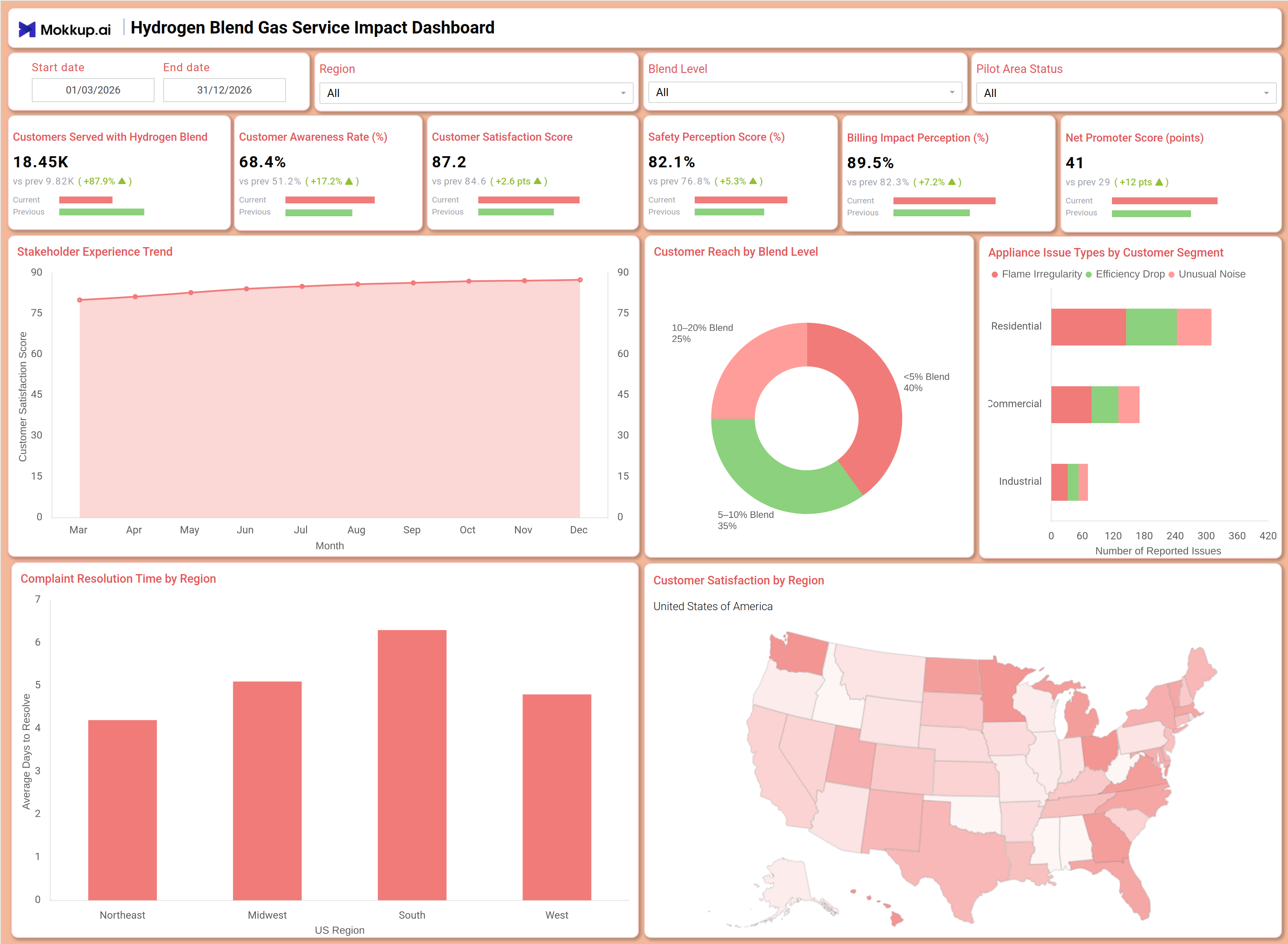
Designed for gas distributors running blend-level pilot programs, this dashboard helps teams track how customers across different blend levels and regions are responding to hydrogen-enriched gas supply, enabling faster evidence-based decisions throughout the program lifecycle. By surfacing complaint resolution time by region and appliance issue tracking by customer segment, it bridges operational data with customer sentiment in a way that supports transparent stakeholder reporting for hydrogen energy programs.
How to Create a Hydrogen Blend Gas Service Impact Dashboard
You don’t need to build your report from scratch, just start with a ready-to-use Hydrogen Blend Gas Service Impact dashboard template from Mokkup. Add in your data and export it however you like. Here’s how to do it:
1. Create or Log in to Your Mokkup Account
Start by signing up on Mokkup.ai using your email. If you already have an account, just log in, and you'll be good to go.
2. Choose and Customize Your Dashboard Template
Find the Hydrogen Blend Gas Service Impact Dashboard template in the Templates section. Use the drag-and-drop editor to adjust KPIs, edit filters, or add elements based on your data.
3. Export to Your BI Tool
Once your dashboard wireframe is ready, use the BI Tool Export feature to send it directly to Power BI or Tableau for further analysis and enhancements. You can also download the dashboard as a PDF, PNG, or JPEG, embed it on a platform, or invite your team to collaborate.
Note: This is a Pro template. You'll need a Pro subscription on Mokkup to use and customize this dashboard wireframe. Upgrade anytime to unlock full access.
Hydrogen Blend Gas Service Impact Dashboard Example
A gas utility operations team monitoring a regional hydrogen blending pilot opens this dashboard to understand how customer sentiment is shifting as blend levels increase across service zones. The overview row of six KPI tiles immediately signals whether customer satisfaction and safety perception are trending positively or flagging areas of concern without needing to dig into raw reports. Using the Blend Level and Region filters, managers can isolate performance for specific pilot areas and compare how residential, commercial, and industrial segments are experiencing appliance-related issues such as flame irregularity, efficiency drops, or unusual noise, insights that directly inform field response priorities.
The Complaint Resolution Time by Region bar chart helps service teams identify which US regions are lagging on resolution speed, while the Stakeholder Experience Trend line chart shows whether satisfaction scores are holding steady or declining month over month, essential context for customer outreach decisions in hydrogen blend distribution impact analysis.
How to Analyze Data in a Hydrogen Blend Gas Service Impact Dashboard
Here is how you can analyze data from this dashboard:
- Filter by Blend Level: Compare KPI performance across different hydrogen blend percentage groups.
- Track Customer Experience Trends: Monitor satisfaction trends to identify early service concerns.
- Analyze Appliance Issues: Review issue types by customer segment to identify recurring service problems.
- Measure Customer Reach: Use the blend level distribution chart to assess pilot adoption.
- Monitor Resolution Times: Compare complaint resolution performance across regions.
- Compare Pilot Areas: Evaluate active pilot zones against baseline regions to measure service impact.
- Track Program Advocacy: Monitor Net Promoter Score trends to assess customer sentiment.
- Identify Low-Satisfaction Regions: Use the geographic map to target outreach and service improvements.
Benefits of a Hydrogen Blend Gas Service Impact Dashboard
The following are the benefits of using this dashboard:
- Centralized Customer Impact View: Combines satisfaction, safety perception, and billing metrics in one dashboard.
- Comprehensive Blend Analysis: Tracks service impact across multiple blend levels and pilot regions.
- Reduced Reporting Effort: Prebuilt KPIs simplify complaint and satisfaction reporting.
- Regional Service Insights: Helps prioritize field service resources based on resolution performance.
- Better Issue Management: Highlights appliance issue trends across customer segments.
- Improved Stakeholder Reporting: Supports utility reporting for hydrogen energy programs.
- Shared Service Visibility: Aligns operations and customer experience teams around service quality performance.
KPIs to Track in a Hydrogen Blend Gas Service Impact Dashboard
The following key KPIs can be tracked by using this dashboard:
- Customers Served with Hydrogen Blend (count): Tracks the total number of customers receiving hydrogen-blended gas supply, a core metric for measuring pilot program reach and hydrogen blend gas customer satisfaction coverage.
- Customer Awareness Rate (%): Measures the share of customers informed about the hydrogen blending program, essential for evaluating outreach effectiveness across blend tiers.
- Customer Satisfaction Score (points): Quantifies overall satisfaction with hydrogen gas service delivery, central to hydrogen utility customer experience monitoring and identifying service quality gaps.
- Safety Perception Score (%): Tracks the percentage of customers who feel safe using hydrogen-blended gas. Consistent gas safety perception monitoring hydrogen blend programs require to sustain public trust is central to pilot program success.
- Billing Impact Perception (%): Measures how customers assess the fairness of billing changes associated with hydrogen blending, a leading indicator of billing-related escalations and churn risk.
- Net Promoter Score (points): Evaluates customer willingness to recommend the service, supporting complaint resolution time by region gas utility assessments and longer-term program viability reviews.
Frequently Asked Questions
Q1. What industries benefit most from this Hydrogen Blend Gas Service Impact Dashboard?
Gas distribution utilities, regional energy regulators, and municipal pilot program managers benefit most from this dashboard. It is specifically designed for teams running hydrogen blending pilots who need to track customer sentiment, safety perception, and complaint resolution across blend tiers and service regions.
Q2. Can this dashboard track appliance issues across different customer segments?
Yes. The Appliance Issue Types by Customer Segment stacked bar chart breaks down reported issues - flame irregularity, efficiency drop, and unusual noise - separately for Residential, Commercial, and Industrial customers, allowing field teams to prioritize responses by segment.
Q3. Is this dashboard suitable for reporting to regulators and energy program stakeholders?
Yes. The dashboard consolidates all customer impact metrics from safety perception and billing impact to complaint resolution time into a structured format that supports transparent stakeholder reporting for hydrogen energy programs and regulatory submissions.