
What is a Fertility Center Operations Dashboard?
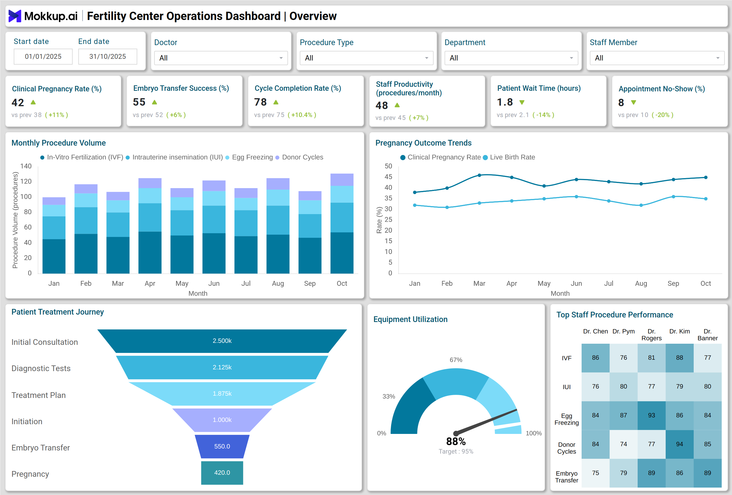
A Fertility Center Operations Dashboard is a centralized analytics platform designed for reproductive medicine clinics and IVF centers. It consolidates clinical, operational, and patient data to provide a real-time view of clinic efficiency, patient throughput, staff productivity, and treatment outcomes. Using this dashboard, fertility center managers can monitor critical KPIs such as clinical pregnancy rates, embryo transfer success, patient wait times, and live birth rates. By integrating IVF clinic operations management dashboards and fertility center patient flow analytics, clinics gain actionable insights to optimize workflow, improve patient experience, and increase overall treatment success.
How to Create a Fertility Center Operations Dashboard
You don’t need to build your report from scratch—just start with a ready-to-use dashboard template from Mokkup. Add in your data and export it however you like. Here’s how to do it:
1. Create or Log in to Your Mokkup Account
Start by signing up on Mokkup.ai using your email. If you already have an account, just log in, and you’ll be good to go.
2. Choose and Customize Your Dashboard Template
Find the Fertility Center Operations Dashboard template in the Templates section. Use the drag-and-drop editor to adjust KPIs, edit filters, or add elements based on your data.
3. Export to Your BI Tool
Once your dashboard wireframe is ready, use the BI Tool Export feature to send it directly to Power BI or Tableau for further analysis and enhancements. You can also download the dashboard as a PDF, PNG, or JPEG, embed it on a platform, or invite your team to collaborate.
Note: This is a Pro template. You’ll need a Pro subscription on Mokkup to use and customize this dashboard wireframe. Upgrade anytime to unlock full access.
Fertility Center Operations Dashboard Example
A typical Fertility Center Operations Dashboard visualizes key metrics in intuitive charts and graphs. For instance, a stacked column chart displays procedure volumes by type and month, enabling managers to track fertility trends over time. Line charts can illustrate clinical pregnancy rates and live birth trends over time, while funnel charts map the patient journey from consultation to cycle completion. Heatmaps highlight staff productivity by procedure type, and gauge charts monitor equipment utilization. Pie charts, treemaps, and waterfall charts provide detailed insights into procedure distribution, inventory usage, and cycle time breakdowns, respectively. Using this example, IVF centers can benchmark performance, optimize resources, and streamline patient care.
How to Analyze Data in Fertility Center Operations Dashboards
Here is how you can analyze data in the Fertility Center Operations Dashboard:
- Track clinical and operational trends through line and column charts.
- Identify bottlenecks in patient flow using funnel and waterfall visualizations.
- Assess staff efficiency by analyzing heatmaps of procedure-specific productivity.
- Monitor equipment and inventory usage with gauge and treemap charts.
- Compare procedure volumes and success rates to forecast resource needs.
- Evaluate patient satisfaction metrics to improve engagement.
Benefits of Fertility Center Operations Dashboards
These are the benefits of using the Fertility Center Operations Dashboard:
- Enhanced Operational Efficiency: Quickly spot bottlenecks and optimize workflows.
- Improved Patient Experience: Reduce wait times and streamline consultations.
- Higher Treatment Success Rates: Track clinical pregnancy and live birth trends.
- Better Staff Performance Management: Monitor productivity and identify training needs.
- Optimized Resource Utilization: Ensure proper inventory turnover and equipment usage.
- Data-Driven Decision Making: Access real-time, actionable insights for strategic planning.
KPIs to Track in Fertility Center Operations Dashboards
Tracking these KPIs helps ensure efficient monitoring of fertility operation outcomes:
- Clinical Pregnancy Rate Percent: Measures the success of IVF procedures.
- Embryo Transfer Success Rate Percent: Tracks the effectiveness of embryo transfers.
- Cycle Completion Rate Percent: Percentage of IVF cycles successfully completed.
- Staff Productivity (Procedures per Staff per Month): Monitors individual and team efficiency.
- Patient Wait Time Average Hours: Evaluates patient flow and scheduling efficiency.
- Appointment No-Show Rate Percent: Reduces wasted time and improves resource planning.
- Live Birth Rate Percent: Key clinical outcome metric for IVF centers.
Frequently Asked Questions
Q1: Who can use a Fertility Center Operations Dashboard?
Clinic managers, IVF coordinators, and reproductive medicine specialists use it to monitor operations and patient outcomes.
Q2: How does it help in resource management?
Treemaps, gauge charts, and inventory turnover metrics ensure optimal use of medications, equipment, and other resources.
Q3: Is the dashboard customizable?
Most dashboards allow for customization to track specific KPIs, visualizations, and reporting schedules tailored to clinic requirements.