
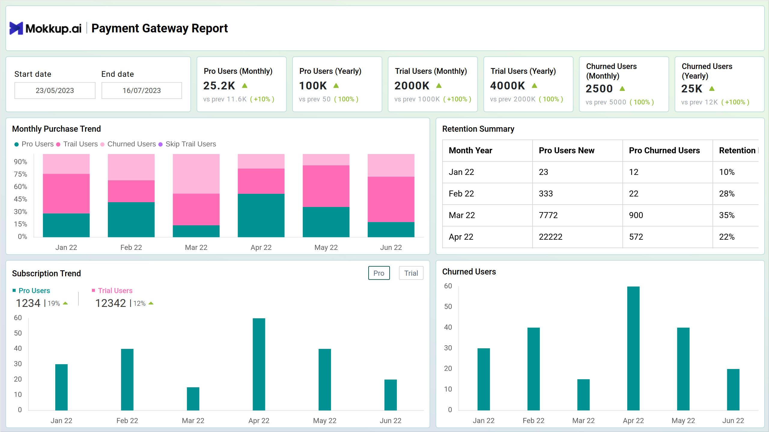
The Payment Gateway Report Dashboard template provides an overview of key performance indicators (KPIs) and trends related to Stripe payment subscriptions. By consolidating essential metrics such as Pro users (monthly/yearly), Trial users (monthly/yearly), and churned users (monthly/yearly), the dashboard wirefrane provides actionable insights into subscription growth, retention, and churn. It helps stakeholders monitor monthly purchases, track subscription trends, and analyze churn patterns to optimize subscription-based revenue streams.
Key Terms to Know
- Monthly Purchase: The stacked column chart helps in tracking revenue generated from different subscription plans and identifying trends in subscription purchases over time.
- Retention Summary: The table provides insights into customer retention patterns and helps identify areas for improvement in subscription retention strategies.
- Subscription Trend: Illustrates the trend in subscription growth over time for Pro and Trial users. It allows stakeholders to monitor subscription trends, track growth directions, and assess the effectiveness of subscription acquisition strategies.
- Churned Users: This chart helps stakeholders understand churn patterns, identify factors contributing to churn, and take proactive measures to reduce churn rates and improve customer retention.
Revenue Summary
Screen 2 of the Payment Gateway Report delves deeper into revenue metrics and customer insights, providing stakeholders with a comprehensive view of revenue generation and customer lifetime value. By presenting key performance indicators (KPIs) such as Revenue (monthly/yearly), Monthly Recurring Revenue (MRR), Annual Recurring Revenue (ARR), churned revenue, and Customer Lifetime Value (CLTV), this screen offers actionable insights into revenue trends and customer value.
Key Terms to Know
- Monthly Revenue Trend: Visualizes monthly revenue trends, broken down into components such as monthly, yearly, and total churned revenue using a stacked column chart. This chart helps stakeholders track revenue performance over time and understand the impact of churn on overall revenue.
- Churn Summary: Displays a summary of churn metrics, including churned revenue and customer cohorts. This table provides insights into churn patterns and helps identify areas for improvement in churn reduction strategies.
- ARPU and CLTV Trend: Illustrates the trend in Average Revenue Per User (ARPU) and Customer Lifetime Value (CLTV) over time using a multi-line chart. This visualization allows stakeholders to monitor changes in customer value and assess the effectiveness of revenue optimization strategies.
- Top Customers by Revenue: Displays the top customers ranked by revenue contribution using a bar chart. This chart helps identify high-value customers and prioritize efforts to retain and nurture these relationships for sustained revenue growth.
Geographical Analysis
Screen 3 of the Payment Gateway Report focuses on geographical insights and revenue distribution across different countries. By presenting key performance indicators (KPIs) such as Country with Max Revenue, Country with Min Revenue, Country with Max Pro Users, Country with Max Trial Users, and Country with Max Churn, this screen offers actionable insights into revenue trends and subscription distribution by location.
Key Terms to Know
- Summary by Country : Displays a summary of subscription activity by country, including the number of Pro users and Trial users in each country.
- Monthly Revenue Trend: Visualizes monthly revenue trends across different countries. This chart helps stakeholders track revenue performance and identify countries contributing the most to overall revenue.
- Users by Location: Illustrates the distribution of users by location on a geographical map. This map visualization provides insights into the geographical spread of customers and helps identify regions with high user concentrations.
- Top Location by Revenue: Displays the top locations ranked by revenue contribution using a bar chart. This chart helps identify geographical regions with the highest revenue generation and prioritize strategic initiatives targeting these regions.
Dashboard Template Insights
Let’s have a look at the important insights:
- The dashboard wireframe helps gain insights into revenue trends, distribution, and performance across different time periods, subscription plans, and locations.
- It allows analysis of customer behavior, feedback, and satisfaction levels to enhance customer retention, improve service quality, and drive long-term revenue growth.
- The dashboard wireframe identifies high-performing regions and emerging markets to prioritize strategic initiatives and allocate resources effectively.
Conclusion
The Payment Gateway Report template provides crucial insights into revenue, subscriptions, and customer behavior. By leveraging KPIs, trend analyses, and geographical data, stakeholders can optimize strategies, enhance customer retention, and maximize revenue. This dashboard wireframe is essential for informed decision-making, improving service quality, and achieving sustainable business growth.