What is a Claims Analysis Dashboard?
A Claims Analysis Dashboard template is used by insurance companies, healthcare providers, and other service sectors to monitor and evaluate claims-related activities. It provides a consolidated view of key metrics like total claims filed, approval and denial rates, average processing time, claim costs, and fraud indicators.
This dashboard wireframe helps stakeholders identify patterns, detect inefficiencies, improve claim processing accuracy, and reduce delays or losses through data-driven decision-making.
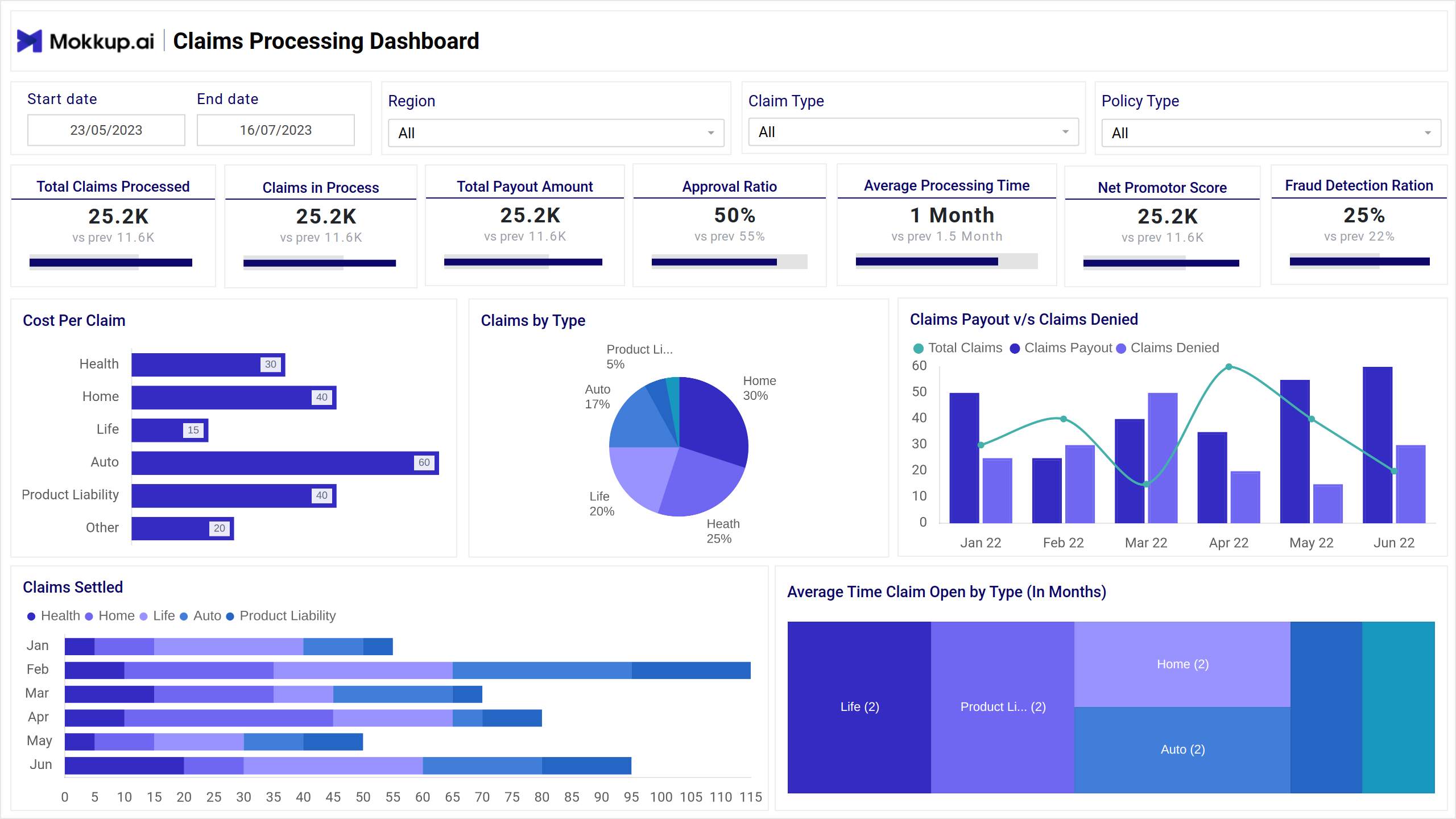
Claims Dashboard Example
The Claims Analysis Dashboard template gives insurance teams a centralized view of claims performance, approval trends, and processing efficiency. It highlights metrics such as total claims filed, approval and denial rates, average claim amount, and processing time.
Tailored for claims analysts, underwriters, and operations heads, this wireframe improves visibility into high-risk cases, detects fraud trends, and ensures that claims are handled promptly. This insurance performance dashboard streamlines day-to-day monitoring and long-term decision-making.
How to Analyze Data in Claims Dashboards
Use the Claims Dashboard template to assess claim volumes, processing efficiency, and payout trends. This layout lets insurance teams spot bottlenecks, monitor fraud, and improve claim turnaround times.
- Track essential KPIs such as total claims processed, claims in progress, payout amount, and approval ratio. Visualizations like line charts and bar graphs show trends in processing speed and denial rates.
- Use filters like policy, region, and claim types to gain detailed insights. Analyze fraud detection ratios, average claim resolution times, and customer satisfaction (NPS) to identify areas for operational improvement.
How to Create a Claims Analysis Dashboard
You don’t need to build your report from scratch—just start with a ready-to-use sample Claims Analysis Dashboard template from Mokkup. Add in your data and export it however you like. Here’s how to do it:
1. Create or Log in to Your Mokkup Account
Start by signing up on Mokkup.ai using your email. Already have an account? Just log in, and you’re good to go.
2. Choose and Customize Your Dashboard Template
Find the Claims Analysis Dashboard in the Templates section. Use the drag-and-drop editor to adjust KPIs, edit filters, or add elements based on your data.
3. Export to Your BI Tool
Once your dashboard wireframe is ready, use the BI Tool Export feature to send it directly to Power BI or Tableau for further analysis and enhancements. You can also download the dashboard as a PDF, PNG, or JPEG, embed it on a platform, or invite your team to collaborate.
Note: This is a Pro template. To use and customize this dashboard wireframe, you’ll need a Pro subscription on Mokkup. Upgrade anytime to unlock full access.
Benefits of Claims Analysis Dashboards
A Mokkup.ai Claims Analysis Dashboard template helps insurance teams track, evaluate, and optimize the entire claims lifecycle. By bringing together key performance indicators, it simplifies decision-making and improves operational transparency. Here are some of the benefits:
- Improves Claims Processing Efficiency: Monitor turnaround times, approval rates, and bottlenecks to streamline workflows and speed up claim resolutions.
- Reduces Fraud and Errors: Spot unusual claim patterns or inconsistencies early with visual insights that highlight anomalies in data.
- Enhances Customer Satisfaction: Faster and more accurate claims processing leads to a better customer experience and improved trust.
- Supports Data-Driven Decisions: Real-time insights into claims performance help managers effectively allocate resources and improve policies.
These dashboards offer a clear, centralized view that helps insurers boost performance while minimizing risks and costs.
KPIs to Track in Claims Dashboards
These KPIs help insurance and operations teams monitor claims performance, improve processing speed, and ensure customer satisfaction.
- Total Claims Processed: Tracks the total number of claims completed within a specific period, indicating overall volume and team efficiency.
- Claims in Process: This shows the number of claims currently under review or being handled, which is useful for workload management.
- Total Payout Amount: This measure measures the total monetary value of claims paid out during the selected time range, helping assess the financial impact.
- Approval Ratio: Percentage of submitted claims that were approved, helpful in understanding acceptance trends and policy effectiveness.
- Average Processing Time: Shows how long it typically takes to process a claim from submission to resolution, helping identify delays.
- Net Promoter Score (NPS): This score reflects customer satisfaction and likelihood to recommend the service, indicating overall service quality.
- Fraud Detection Ratio: Tracks the percentage of claims flagged as potentially fraudulent, useful for risk and compliance monitoring.
Frequently Asked Questions
Q1. What does a Claims Analysis Dashboard help track?
It tracks key metrics such as total claims processed, approval rates, payout trends, and fraud detection, helping insurers optimize claim operations.
Q2. Who uses a Claims Dashboard?
Claims managers, underwriters, and operations teams use it to monitor performance, detect issues, and improve claim processing efficiency.
Q3. How can the dashboard reduce fraud?
The dashboard helps teams focus on investigating high-risk claims by highlighting suspicious patterns and calculating the fraud detection ratio.