
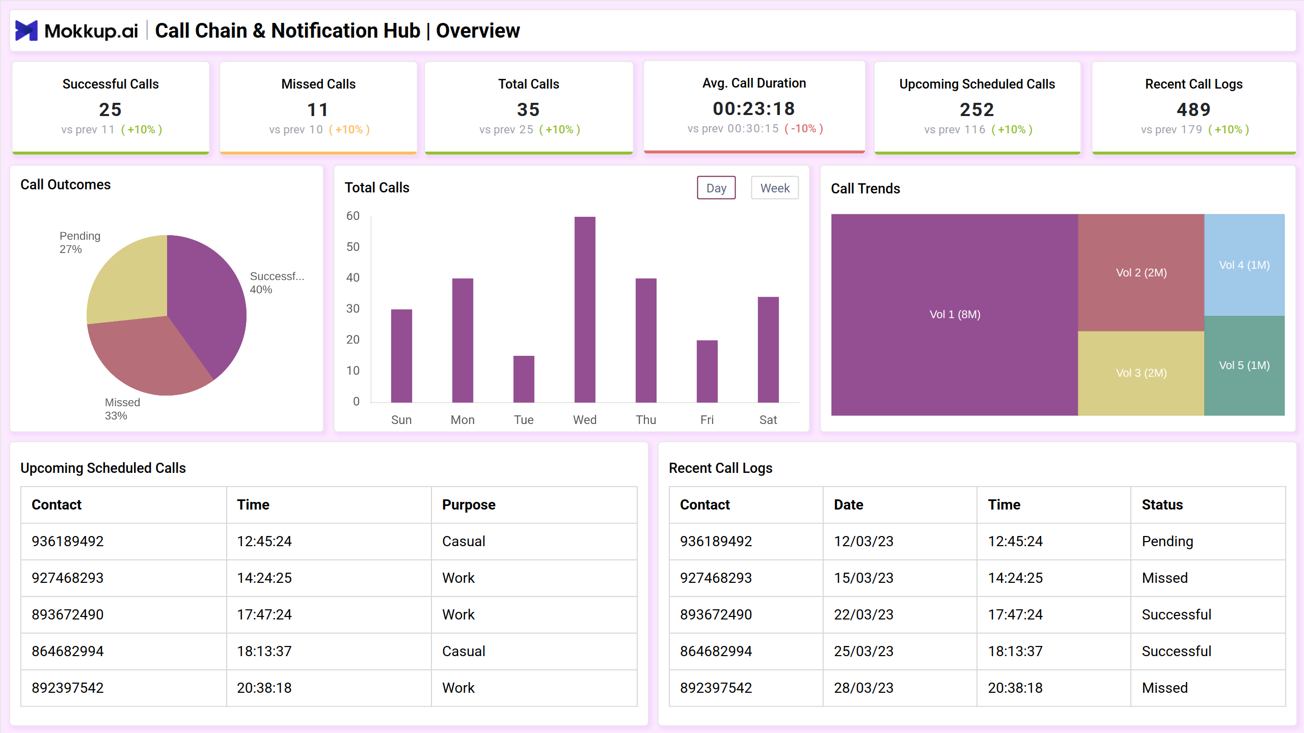
The Call Chain & Notification Hub dashboard template provides a structured view of communication flows and alerts. It helps monitor call sequences, response times, and notification effectiveness, ensuring seamless coordination. With detailed metrics and visual insights, businesses can enhance responsiveness, streamline operations, and improve overall communication efficiency.
Overview
This dashboard provides a structured view of communication activity, showcasing key performance indicators like interaction success rates, total volume, and duration trends. With visual elements such as pie charts and bar graphs, along with detailed logs of past and upcoming interactions, it offers a clear snapshot for efficient monitoring and decision-making.
Key Terms to Know
- Successful Calls: Displays the number of completed interactions with a comparison to the previous period.
- Missed Calls: Shows the count of unanswered interactions and the percentage change from the last period.
- Total Calls: Represents the overall number of interactions recorded within the timeframe.
- Average Call Duration: Highlights the typical length of interactions, indicating any increase or decrease.
- Upcoming Scheduled Calls: Lists future interactions with details like contact, time, and purpose.
- Recent Call Logs: Provides a history of past interactions, including status updates.
- Call Outcomes: A pie chart visualizing the proportion of completed, missed, and pending interactions.
- Total Calls (Graph): A bar chart showing daily interaction volume trends over a selected period.
- Call Trends: A visual breakdown of interaction categories based on volume.
Real-Time Call Tracking
This view provides an insightful overview of communication performance, visualizing success rates and outcomes over time. It includes detailed logs of recent interactions, highlighting responsiveness and engagement. The data helps identify patterns and areas for improvement, supporting efficient management of communication channels and enhancing overall connectivity.
Key Terms to Know
- Total Calls Made: Displays the number of interactions initiated within the given timeframe.
- Success Rate: Indicates the percentage of successful interactions compared to total attempts.
- Missed Calls Rate: Shows the proportion of unanswered interactions.
- Voicemail Rate: Represents the percentage of interactions that ended in voicemail.
- Call Success Rate Graph: Tracks the fluctuation in successful interactions over multiple attempts.
- Call Status Breakdown: Visualizes the distribution of successful, missed, and voicemail interactions.
- Real-Time Call Log: Provides a detailed record of recent interactions, including status and response times.
Performace Analysis
This screen provides an overview of different communication metrics, highlighting interaction duration, response patterns, and audio quality. It also presents a breakdown of outcomes, showing engagement levels and connection issues. The visual elements help analyze trends and identify areas that may need adjustments for improved efficiency.
Key Terms to Know
- Average Session Time: Displays the typical duration of conversations, with a slight increase from the previous period.
- Average Response Time: Indicates how long it takes to reply, showing a small improvement.
- Longest Response Times: Highlights the highest waiting period recorded, reflecting a recent increase.
- Voice Clarity Rate: Measures audio quality, showing a decline from the prior value.
- Response Time Distribution: Visualizes the variation in reply durations across different interactions.
- Call Outcome Breakdown: Shows the proportion of completed, missed, and disrupted connections.
- Average Call Duration: Represents the mean length of interactions.
- Average Response Time: Reiterates the typical time taken to reply in conversations.
- Calls Requiring Follow-Up: Counts instances that need additional engagement.
- Success Rate by Department: Displays effectiveness levels across different sections.
- Voicemail Duration: Shows the average length of recorded messages.
Dashboard Template Insights
Here are the key insights the dashboard wireframe provides:
- Provides a structured display of key performance indicators, helping to assess engagement and efficiency.
- Uses graphs and charts to highlight trends in response times, clarity, and call outcomes.
- Tracks key aspects like session length, follow-ups, and completion rates for better decision-making.
- Helps identify areas for improvement by comparing current metrics with past performance.
Conclusion
This dashboard wireframe simplifies the process of reviewing communication activities, offering clear insights into engagement, timing, and overall effectiveness. With structured visuals and key statistics, it helps identify areas for improvement, making it easier to refine processes and enhance overall efficiency.