What is an Email Marketing Dashboard?
The email marketing dashboard contains the necessary KPIs and metrics to measure the effectiveness of email campaigns with a single cohesive view. The best email marketing dashboard can help you identify the most relevant marketing strategies and optimize your campaigns toward the end goal.
Benefits of Email Marketing Dashboards
The email marketing dashboard template can pull data from multiple sources and provide a centralized view that greatly automates analytics. Here are some benefits of using this dashboard:
- Tracking major metrics gives you a reality check on the loopholes.
- A concise view of email marketing performance improves decision-making.
- It significantly saves time and effort when consolidating data.
- By optimizing campaigns, you can improve the ROI and achieve business growth.
Email Marketing Dashboard Example
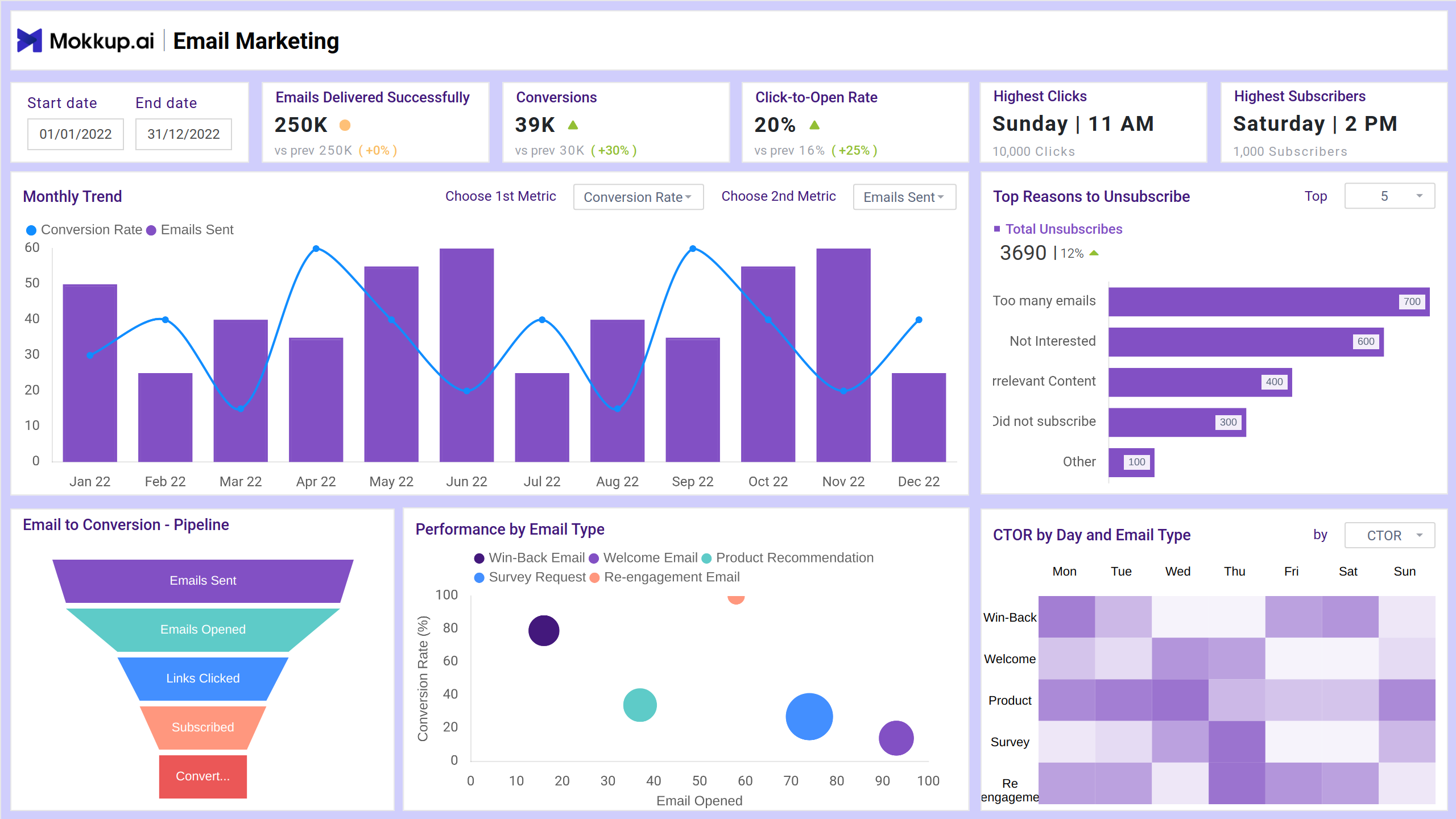
The structure of the email marketing performance dashboard includes various sections that showcase overall campaign performance, specific campaign comparisons, and deeper email marketing analysis. At the top, the dashboard typically features high-level metrics such as total emails sent, open rates, click-through rates (CTR), bounce rates, unsubscribe rates, and conversion rates. These are displayed as easy-to-read tiles or widgets, providing an immediate snapshot of performance. Filters can be applied to drill down into more granular insights for decision-making and analysis.
KPIs to Track in Email Marketing Dashboards
This email campaign dashboard can help monitor the metrics such as:
- Emails Delivered: It represents the number of emails successfully delivered to recipients' inboxes (or at least not bounced).
- Conversions: It tracks the number of users who completed a desired action after clicking a link in your email.
- Click-to-Open Rate: This KPI measures how effectively your email content encourages recipients to click on links after they’ve opened the email.
- Highest Clicks: It refers to the email campaign (or specific link within a campaign) that received the most clicks during a specific time period.
- Highest Subscribers: The email list segment, campaign, or source that has generated the most new subscribers over a specific time period.
- Email to Conversion Pipeline: Measures how effectively your email campaigns drive subscribers through the funnel, from receiving an email to ultimately converting.
- Performance by Email Type: It evaluates the performance of email campaigns by different email types.
- CTOR by Day and Email Type: This graph determines the campaign performance by different days and email types.
How to Create an Email Marketing Dashboard
You don’t need to build your report from scratch. You can start with a ready-to-use sample email marketing dashboard template from Mokkup. Plug in your data and export it however you like. Here’s how to do it:
1. Create or Log in to Your Mokkup Account
2. Choose and Customize Your Dashboard Template
3. Export to Your BI Tool
Note: This is a Pro template. To use and customize this dashboard wireframe, you’ll need a Pro subscription on Mokkup. Upgrade anytime to unlock full access.
How to Analyze Data in Email Dashboards
Analyzing data in an Email Marketing Dashboard is all about turning metrics into actionable insights. Here's a step-by-step guide to doing that effectively:
-
Start with your goal (engagement, conversions, or bounce rate)
-
Identify key metrics
-
Use Filters: By Day, Device, or Type
-
Spot Patterns & Anomalies
-
Break down the audience and compare
-
Based on your analysis, take action
Frequently Asked Questions
1. Why do I need an Email Marketing Dashboard?
It helps you:
- Monitor campaign performance at a glance
- Identify what’s working and what’s not
- Make data-driven decisions quickly
- Improve ROI by optimizing future campaigns
2. What is CTOR, and why is it important?
CTOR (Click-To-Open Rate) = Clicks ÷ Opens. It tells you how effective your email content is after the email is opened, which indeed is a better measure of content quality than CTR alone.