A Customer Satisfaction Analysis dashboard is a comprehensive tool used by businesses to monitor, measure, and analyze various metrics related to customer satisfaction. It serves as a centralized platform that aggregates data from different sources. The dashboard enables businesses to identify areas for improvement, make informed decisions, and ultimately enhance the overall customer experience.
Key Terms to Know
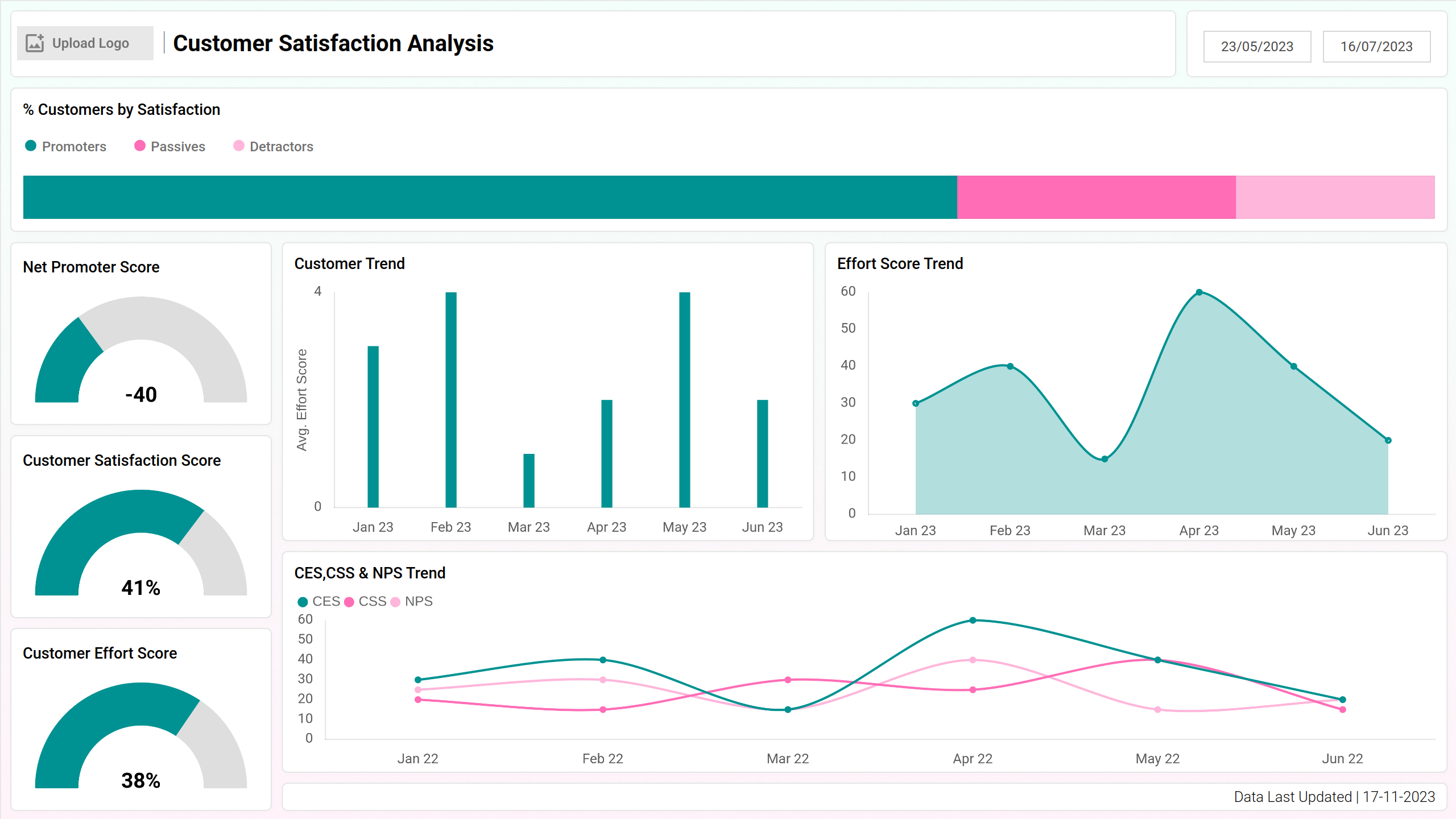
Let's have a look at the important insights that can be gained from this dashboard wireframe:
- Net Promoter Score: Net Promoter Score (NPS) gauges customer loyalty by asking, "How likely are you to recommend our product/service?"—a single metric reflecting the likelihood of customers becoming brand advocates.
- Customer Satisfaction Score: A Customer Satisfaction Score (CSAT) is a simple yet powerful metric that quantifies the level of customer satisfaction with a product or service through direct feedback.
- Customer Effort Score: Customer Effort Score (CES) measures the ease with which customers can accomplish tasks or resolve issues, providing valuable insights into the overall user experience.
- Percentage of Customers by Satisfaction: This visualization illustrates the distribution of customers into three categories: promoters, passives, and detractors. Promoters are customers who rate highly, passives are neutral, and detractors are dissatisfied customers. The stacked bar chart shows the proportion of each category relative to the total number of customers.
- Customer Trend: It presents the changes in customer satisfaction over time, with each column representing a specific time period, such as months or quarters. The height of each column indicates the overall satisfaction level during that period.
- CES, CSS & NPS Trend: It showcases the trends of Customer Effort Score (CES), Customer Satisfaction Score (CSS), and Net Promoter Score (NPS) over time. Each metric is represented by a separate line on the chart, ideal for showing continuous data points over time and identifying patterns in customer satisfaction and loyalty metrics.
Survey Analysis
The Survey Analysis screen of the Customer Satisfaction Analysis dashboard provides an overview of customer feedback and survey responses. From demographic insights represented to product evaluations, this screen equips businesses with actionable insights to enhance product quality and customer satisfaction.
Key Terms to Know
- Survey Respondents per Age Group: This visualization displays the distribution of survey respondents across different age groups using a treemap layout. Each rectangle in the treemap represents an age group, with the size of the rectangle indicating the proportion of respondents in that group.
- Product Quality: A pie chart depicting the distribution of responses regarding product quality, categorizing responses into different quality ratings such as excellent, good, and poor.
- Customer Satisfaction with Product: Another pie chart illustrating the distribution of responses related to overall customer satisfaction with the products.
- Respondents per State: The geographic map shows the distribution of survey respondents across different states. Each state is shaded based on the number of respondents, providing a visual representation of regional participation in the survey.
- Customer Survey Trend: Tracks the trend of survey responses over time, showing how customer sentiment towards the product has evolved.
- Top N Suggestions for Each Product: The table represents the top suggestions or feedback provided by customers for each product.
Customer Support
Screen 3 of the customer satisfaction analysis dashboard offers key performance indicators and operational metrics related to customer support and service. This screen equips businesses with actionable insights to optimize support operations.
Key Terms to Know
- Total Requests: Represents the total number of requests or inquiries received from customers within a specific period. Provides insights into the volume of customer interactions and the workload of the support team.
- Answered Requests: Indicates the number of requests or inquiries that have been successfully addressed or resolved by the support team within the same period. Measures the team's responsiveness and efficiency in handling customer inquiries.
- Total Revenue: Represents the total income generated from sales or service transactions over a defined period. Offers insights into the financial performance of the business and the effectiveness of customer service in driving revenue.
- Support Cost: Showcases the total expenses incurred in providing customer support services. Helps in understanding the cost-effectiveness of support operations and optimizing resource allocation.
- Tickets Created vs Resolved: This chart provides insights into the efficiency of support operations and the ability to manage incoming requests effectively.
- Donut Charts (Current Status, Open Tickets, Customer Feedback): Visually represents the different aspects of ticket management, including the current status of tickets, the distribution of open tickets by category, and customer feedback sentiment.
- Average Time Taken to Resolve Issues: This chart helps identify trends and areas where improvements in response and resolution times are needed.
- Missed Calls Current Month: The table enables support teams to follow up on missed calls promptly and address customer inquiries or issues effectively.
Dashboard Template Insights
- The dashboard tracks NPS, CSAT, and feedback sentiment analysis to pinpoint strengths and weaknesses in customer satisfaction and loyalty.
- Metrics on tickets created vs. resolved, average resolution time, and support costs highlight customer support efficiency, helping resource optimization and process streamlining.
- Product quality ratings, customer satisfaction with products, and improvement suggestions guide prioritization of product enhancements to meet customer needs.
- KPIs like total revenue and support costs reveal the financial impact of customer satisfaction, helping businesses allocate resources to maximize returns.
Conclusion
The Customer Satisfaction Analysis dashboard serves as a powerful tool for businesses to understand, monitor, and improve customer satisfaction across various touchpoints. By using a combination of qualitative and quantitative metrics, businesses can gain actionable insights into customer sentiment, operational efficiency, product quality, and financial performance.
With these insights, organizations can make informed decisions, implement targeted initiatives, and continuously enhance the customer experience to drive long-term growth and success.