
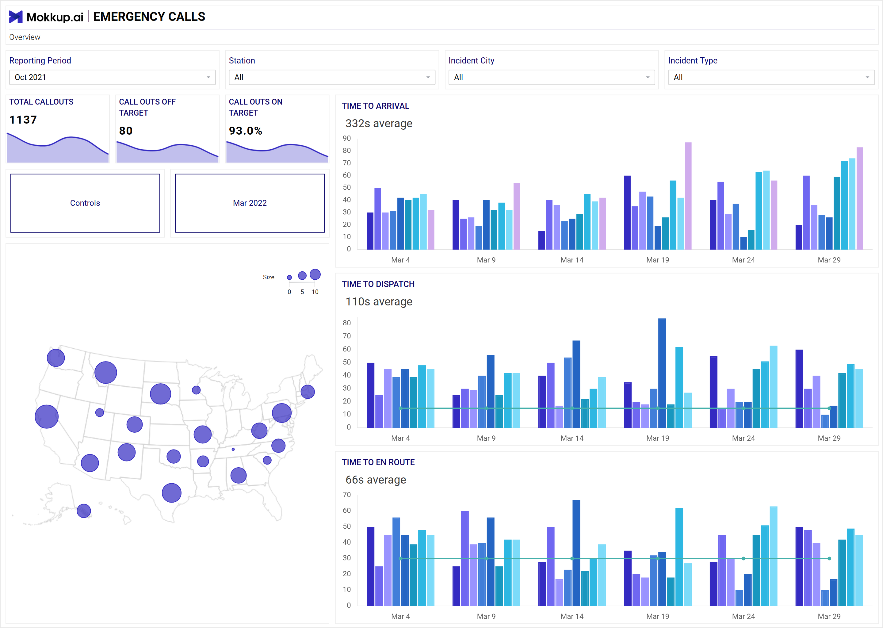
Emergency calls are a critical dashboard that helps users understand how their emergency response teams function. Since most of these calls tend to be sensitive and require immediate response, understanding how the teams respond will help enterprises know where to divert their resources to help with maximum efficiency and utility. This dashboard wireframe is critical because it provides all the requisite information for emergency response teams to gauge their efficiency and timeliness in response.
This dashboard wireframe is split into two pages. The first page summarizes everything important, and the second helps the enterprise drill deeper to understand how individual stations and offices function.
Screen 1: Overview
This screen encompasses vital details, including the reporting period, station, incident city, incident type, time to arrival, time to dispatch, cluster map, total callouts, callouts of target, callouts on target, and time to En Route.
Key Terms to consider:
- Reporting Period: Indicates the timeframe covered by the report.
- Station: Identifies the specific location or unit involved in the incident response.
- Incident City: Specifies the city where the incident occurred.
- Incident Type: Describes the nature or category of the incident.
- Time to Arrival: Records the duration for responders to arrive at the scene.
- Time to Dispatch: Tracks the time taken to dispatch responders after receiving the incident report.
- Cluster Map: Provides a visual representation of incident clusters or hotspots.
- Total Callouts: Reflects the overall number of incidents or calls received.
- Callouts of Target: Indicates the number of incidents that meet specific criteria or targets.
- Callouts on Target: Details the number of incidents where responders successfully addressed the target.
- Time to En Route: Measures the duration from receiving the callout to when responders are en route to the incident location.
Screen 2:
This screen showcases key metrics, including the top station by the percentage of callouts on target, total stations by total callouts, reporting period, incident type, station, incident city, and controls.
Key Terms to consider:
- Top Station by Percentage of Callouts on Target: This indicator identifies the station that responds most successfully to targeted incidents.
- Total Stations by Total Callouts: Lists all stations ranked by the number of incidents responded to.
- Reporting Period: Specifies the timeframe covered by the report.
- Incident Type: Describes the nature or category of the reported incidents.
- Station: Indicates the specific location or unit involved in incident response.
- Incident City: Specifies the city where the incidents occurred.
- Controls: Refers to additional features or options available on the screen for data manipulation or analysis.
Dashboard Template Insights
The Emergency Calls Dashboard is vital for optimizing emergency response teams' efficiency. It offers insights into response times and incident types. Split into two pages, it provides an overview and detailed station performance analysis. Key metrics like time to arrival and callouts on target enable accurate assessment of effectiveness. This dashboard allows organizations to make data-driven decisions to ensure timely and efficient emergency responses.
Conclusion
Since emergency calls are often the first point of contact for many customers, having an accurate dashboard is critical for management to make data-driven decisions. This dashboard wireframe helps create the perfect dashboard.