
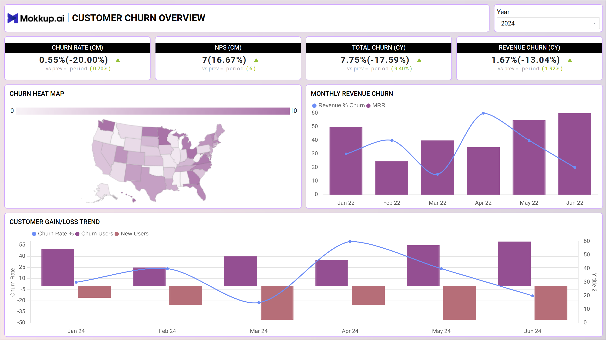
Churn is a key business term for customers who end their relationship with the company. Analyzing churn includes knowing the churn rate, why it happens, who my churning customers are, and how it can be reduced. This dashboard template offers businesses a centralized view of churn metrics, providing valuable insights into customer attrition. Businesses can identify at-risk customers and implement targeted retention strategies by visualizing key indicators such as churn rate, revenue churn, NPS, MRC, and more.
Key Terms to Know
- Churn Rate- Percentage of customers that stopped using a company's product or services during a given period of time.
- Revenue Churn- Percentage of total revenue/MRR lost due to churned customers during a given period.
- Net Promoter Score (NPS)—A score used to track customer satisfaction and loyalty. It measures the likelihood of customers recommending the product to others (ranges from 0 to 10).
- Monthly Revenue Churn- % of recurring revenue lost from customers who canceled in the selected period, highlighting the impact on financial health.
Dashboard Template Insights
This dashboard wireframe empowers businesses to analyze user engagement in greater detail, facilitating targeted strategies to enhance performance and reduce churn. Below are some key takeaways:
- Understand how users interact with your website to improve performance.
- Dive deeper into segments like subscription plans or geographic regions to find areas where users are leaving the most.
- See exactly how much money you're losing when customers churn and how it affects your business.
Conclusion
Businesses that better understand the causes of customer churn will always be adequately positioned to outsmart their competitors. The ability to select the most significant features that cause churn can enhance prediction accuracy and help companies take the right call at the right time to reduce churn proactively.