
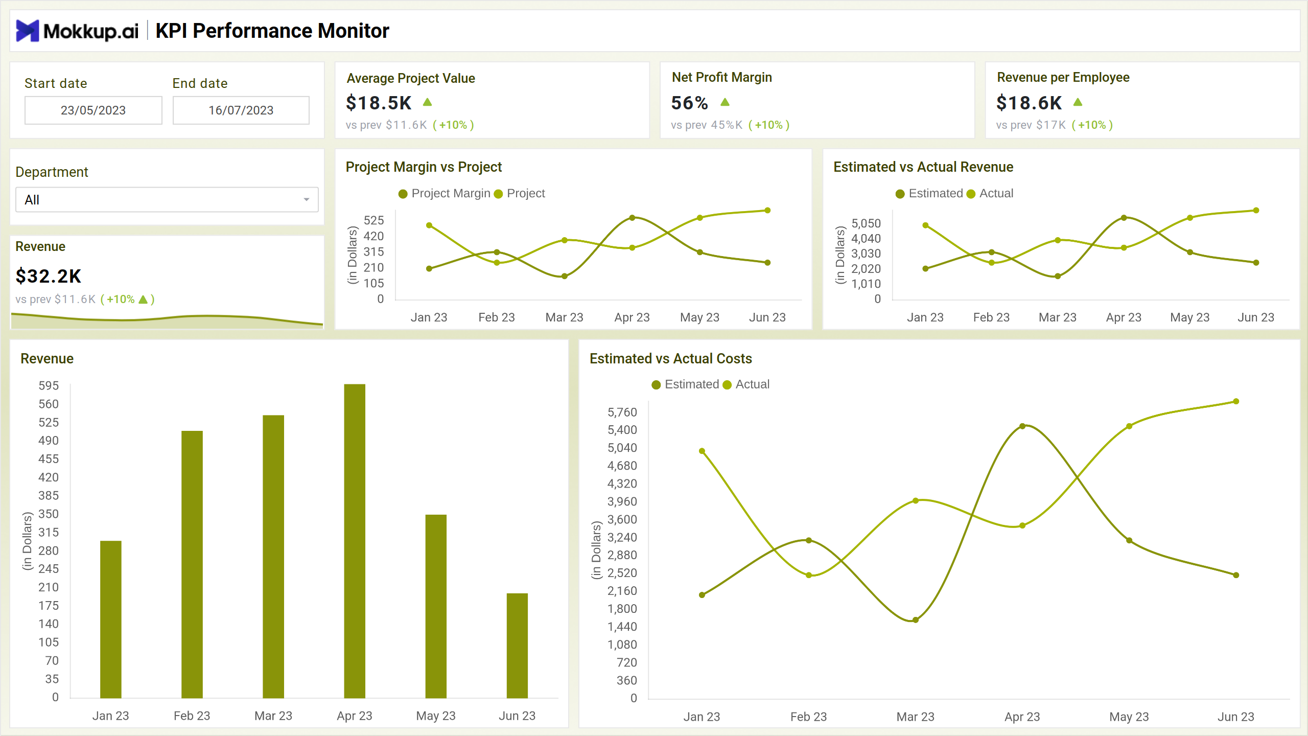
The Professional Services KPI Tracking dashboard wireframe serves as a foundational blueprint for monitoring key performance indicators (KPIs) crucial to the success of professional service firms such accounting firms, marketing agencies, etc. This essential tool visually represents data points and metrics vital for evaluating business performance and strategic decision-making.
The dashboard wireframe comprises three screens: Financial Performance, Resource Utilisation, and Project Details; each is explained briefly below.
Financial Performance
This financial performance screen is a blueprint for a dashboard that visualizes key financial metrics. It allows users to track revenue, net profit, and project margin and compare performance against previous periods. This wireframe provides valuable insights to monitor financial health and identify areas for improvement.
Key Terms to Know
- Revenue: Tracks the total income generated by the company over a specific period.
- Net Profit Margin: Measures the percentage of revenue that translates into profit after accounting for all expenses.
- Average Project Value: Calculates the mean value of all projects undertaken by the company.
- Project Margin vs Project: Compares the profit margin of individual projects against each other.
- Estimated vs Actual Revenue: Contrasts projected revenue with actual revenue to evaluate performance accuracy.
Resource Utilisation
This view tracks various metrics related to a professional services organization, including billable utilization, average hourly, and churn rates. Resource utilization dashboards can help businesses understand how effectively they use their staff.
Key Terms to Know
- Billable Utilization Rate: Measures the time consultants spend on billable client work.
- Average Hourly Rate: Determines consultants' mean hourly rate for their services.
- Churn Rate: Evaluate the percentage of consultants leaving the company within a specified period.
- Average Projects per Consultant: Calculates the average number of projects assigned to each consultant, indicating workload distribution.
Project Details
This Project Details wireframe depicts a dashboard that tracks the progress and performance of various projects. It displays the project name, client, project manager, status, estimated and actual billable hours, and project overrun. This dashboard helps project managers monitor project health and identify resource allocation issues.
Key Terms to Know
- Project Overrun: Indicates the extent to which a project's actual duration exceeds its planned duration.
- Project Distribution by Status: Illustrates the distribution of projects across different statuses (e.g., not started, completed, in progress).
- Project Details: Provides comprehensive information on individual projects, including key milestones, assigned resources, budget allocation, and progress updates.
Dashboard Template Insights
Professional Services KPI Tracking dashboard wireframe drives efficiency and profitability by monitoring crucial metrics. Here are some key insights:
- The template facilitates informed decision-making by providing real-time insights into key performance indicators, enabling swift and strategic actions.
- The dashboard optimizes resource allocation by tracking metrics such as billable utilization rates and project margins, ensuring maximum efficiency and profitability.
- Monitoring metrics like project profitability and average project value enables adjustments to service delivery, enhancing client satisfaction and fostering long-term relationships.
Conclusion
In conclusion, the Professional Services KPI Tracking dashboard wireframe is an indispensable tool for modern professional service firms. By offering insights into key performance indicators, it empowers decision-makers to optimize resource allocation, enhance client satisfaction, and mitigate risks effectively. With its user-friendly interface and comprehensive analytics, this dashboard catalyzes driving operational excellence and achieving sustainable growth in the dynamic business landscape.