

Effects Theme
Give every element on your dashboard wireframe a consistent finish, rounded corners, padding, background color, shadows, and borders, with Effects Themes.
What is Effects Theme?
An Effects Theme controls the visual finishing touches on your dashboard: corner rounding, padding, element background color, drop shadow, and stroke, plus canvas-wide options like background color and an image background. Effects Themes work the same way as Color Themes and Text Themes. Apply a ready-made theme, or customize your own and save it for reuse.
Effects Themes can be applied at two levels:
- Project level: apply one set of effects, plus canvas background options, to every screen in the project.
- Element level: override the effects on a single element, such as a chart, KPI, or filter, without changing the rest of the dashboard.
How to Use?
Project Level
- Open a project and click 'Design' in the left menu panel.
- Under 'Active Effects Theme', click 'Change Effects Theme'.
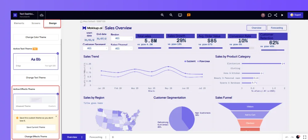
- Browse the 'Default' tab for ready-made themes (for example, Default, Aurora, Glow, Sketch), each labeled for a light or dark background.
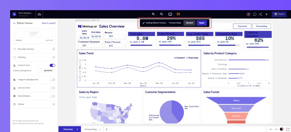
- Hover over a theme card and click 'Apply' to use it as is, or 'Edit' to customize it first.
- If you choose 'Edit', your changes preview live on the canvas in Preview Mode. Click 'Apply' in the top bar to save and use them, or 'Discard' to cancel.
Element Level
There are two ways to reach Effects Theme options for a single element:
Way 1: From the element's edit panel
- Select an element on the canvas to open its edit panel.
- Near the bottom of the left panel, expand 'Element Effects'.
- This opens an Element Effects editor for just that element, with Rounded Corners, Padding, Element Color, Drop Shadow, and Stroke options. (Image As Background and Canvas Color only apply at the project level, since they affect the whole canvas.)
Way 2: From the floating toolbar
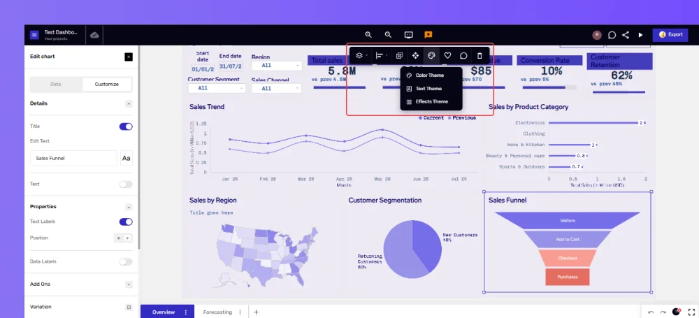
- Click any element on the canvas to select it.
- In the floating toolbar above the element, click the 'Theme & Customization' icon.
- Select 'Effects Theme' from the menu. Color Theme and Text Theme are also available from this same menu.
- Adjust the Rounded Corners, Padding, Element Color, Drop Shadow, or Stroke settings for that element. Changes apply directly to the element as you make them.
Tip: Whichever change you make most recently is the one that sticks. For example, if you customize an element's effects and then apply a new project-level Effects Theme, the project theme overrides that element's custom styling, and the reverse holds too.
How to Customize?
An Effects Theme is made up of the following settings. Some are available at both project and element level; two (marked below) only apply at the project level, since they affect the whole canvas rather than a single element.
- Rounded Corners: set a corner radius in pixels to round off an element's edges.
- Padding: adjust the inner and outer spacing around an element's content.
- Element Color: turn on a background fill for the element and set its color or hex code.
- Image As Background (project level only): use an uploaded image as the canvas background instead of a solid color.
- Canvas Color (project level only): set the background color of the canvas itself, with a hex code option.
- Drop Shadow: toggle a shadow on and adjust its X and Y offset, spread, blur, and color.
- Stroke: add a border around the element by setting a stroke color and width.
Tip: Rounded Corners, Padding, Element Color, Drop Shadow, and Stroke are collapsible sections. Click a section's name to expand it and reveal its settings.
Tip: The canvas can have only one background at a time. Turning on Image As Background disables Canvas Color.
Naming and Saving Custom Effects Themes
When you select an existing effects theme, you can preview it and click 'Apply' to use it as is. Once you customize an existing theme's corners, padding, colors, shadow, or stroke, Mokkup treats it as a new custom theme. Here's how to name and save it so you can reuse it later:
- Adjust the Rounded Corners, Padding, Element Color, Drop Shadow, Stroke, and, at the project level, Canvas Color or Image As Background, as you prefer.
- Click 'Save & Apply' at the top of the dashboard.
- Clicking it opens a pop-up where you name your new custom theme.
- To rename your custom theme later, click the pencil icon next to its name at the top of the panel.
- If you try to navigate away with unsaved changes, Mokkup shows an “Unsaved theme changes” prompt, asking you to save and apply or discard them.
- Your saved custom theme appears under the 'Custom' tab and can be reused on any project.
Note: If you've made effects customizations on an existing project that haven't been saved yet, the Design tab shows a "Save Current Theme" option under Active Effects Theme, letting you save them as a new custom theme for future use.
Shared Text Themes in Team Projects
When you apply a custom Effects Theme to a shared project, it becomes available to every collaborator on that project. Collaborators can apply and edit it as well.
This was a complete guide to using Effects Themes on Mokkup. For further questions, please ask our Chatbot or contact Support.