In the digital age, customer-facing visualizations have become a critical aspect of business communication. These visual representations, such as websites, mobile apps, and interactive displays, play a vital role in engaging customers and creating a memorable brand experience.
Customization and branding are two key factors that significantly impact the effectiveness of customer-facing visualizations. In this blog post, we will explore how Vizzly, a powerful embedded analytics tool, can help elevate your customer-facing dashboards, leveraging mokkup wireframes. We will delve into the significance of customization and branding and how Mokkup & Vizzly empower you to create visually stunning and personalized dashboards that resonate with your brand identity. Let's dive in!
Table of Contents
- Understanding the Importance of Customization and Branding in Customer-Facing Visualizations
- Introducing Vizzly: A Powerful Tool for Customer-Facing Analytics
- Leveraging Mokkup Designs for Customization
- Customer-Facing Dashboard Best Practices
- The Ability to Bring Balance Between Customization & Usability
Understanding the Importance of Customization and Branding in Customer-Facing Visualizations
Customization and branding play a significant role in shaping customer engagement and perception. Customization allows businesses to tailor their products or services to meet individual customer needs and preferences, fostering a sense of personalization. This level of customization creates a strong connection between the customer and the brand, increasing customer engagement and loyalty. Furthermore, effective branding helps establish a distinct identity and reputation for a company, influencing how customers perceive and interact with it. A well-crafted brand image can evoke positive emotions, build trust, and differentiate a business from its competitors, enhancing customer engagement and perception. In this section, we will delve into the benefits of personalized visualizations and how they can enhance the user experience and strengthen brand loyalty.
1. Consistent Branding:
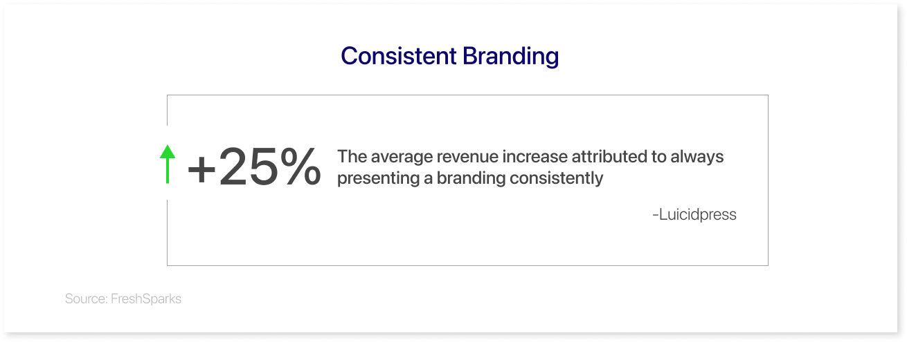
By incorporating personalized dashboard visualization that aligns with your brand's look and feel, you can maintain consistency in your brand's identity across various platforms and communication channels. This consistency helps reinforce your brand image and creates a cohesive and recognizable visual experience for your audience.
2. Enhanced Brand Recognition:
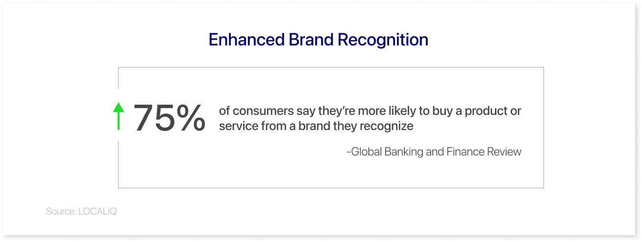
When your visualizations consistently reflect your brand's unique style and aesthetics, it becomes easier for your target audience to identify and remember your brand. This increases brand recognition, which leads to improved recall and can contribute to higher brand loyalty and engagement.
3. Improved User Experience:
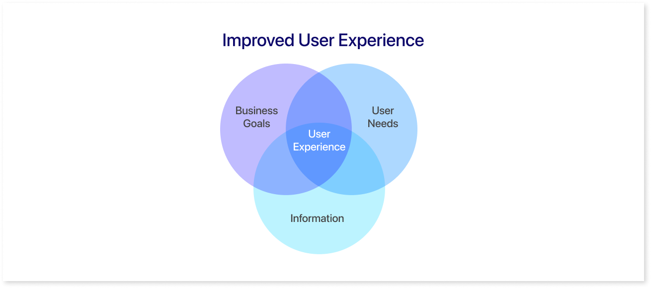
Personalized visualizations can enhance the user experience by making it more visually appealing and engaging. When your visuals align with your brand's look and feel, it creates a sense of familiarity and comfort for your users, making it easier for them to navigate and interact with your content or products.
4. Increased Trust and Credibility:
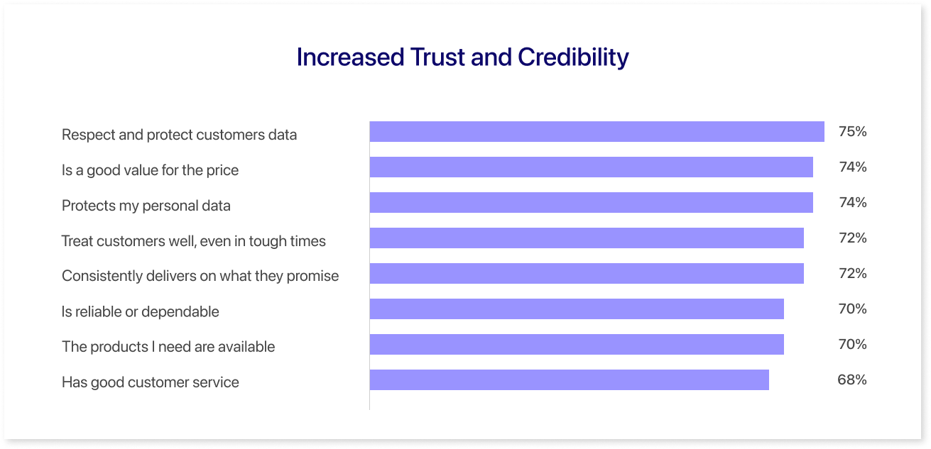
Visual consistency helps build trust and credibility with your audience. When your brand's visualizations are aligned and coherent, they convey a sense of professionalism and attention to detail. This consistency creates a positive impression, suggesting your brand is reliable, trustworthy, and committed to delivering quality.
5. Differentiation from Competitors:
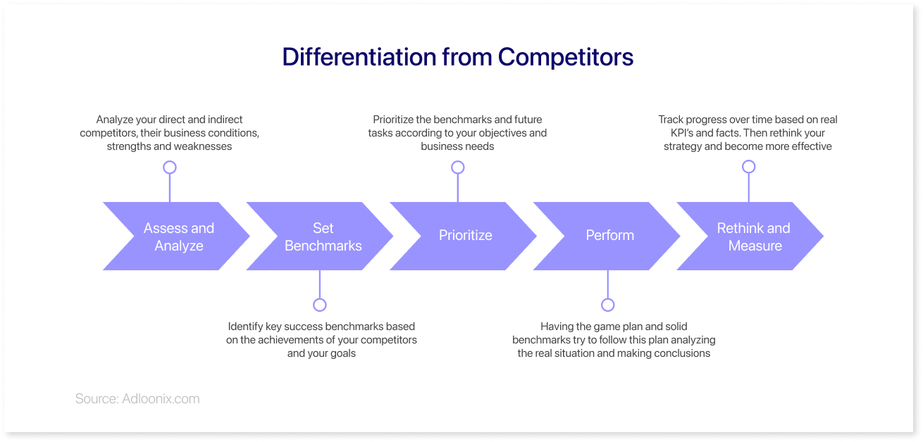
Personalized visualizations that align with your brand's look and feel set you apart from your competitors. It helps create a unique and recognizable visual identity that distinguishes your brand in a crowded marketplace. When your visuals reflect your brand's personality and values, it becomes easier for customers to connect with your brand on a deeper level.
6. Strengthened Emotional Connection:
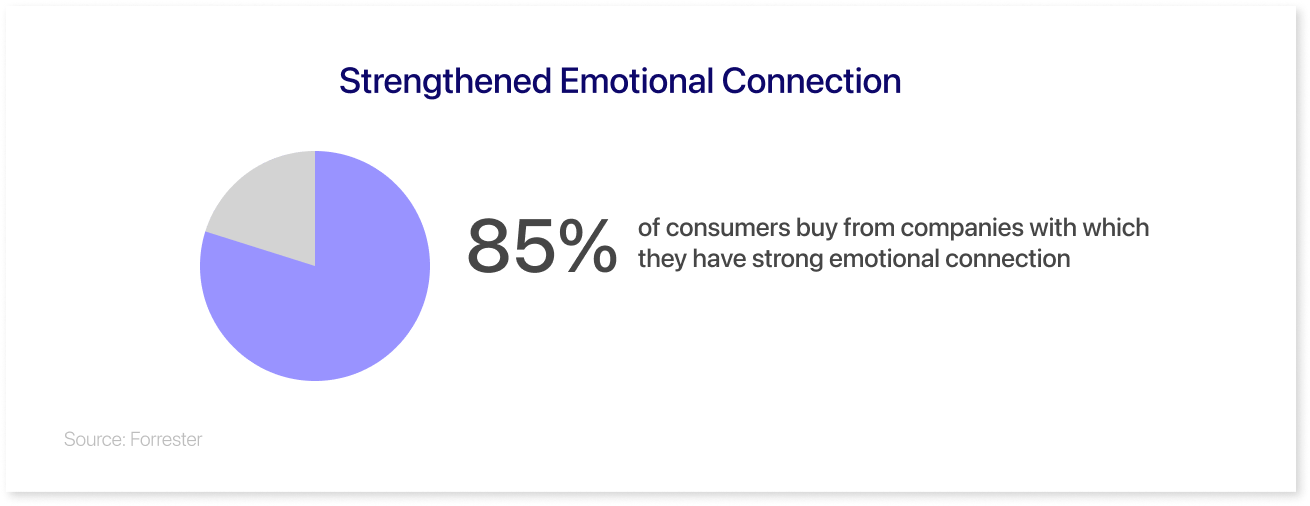
Visuals have a powerful impact on emotions and can evoke specific feelings or associations. When your personalized visualizations align with your brand's look and feel, they have the potential to evoke positive emotions and create a stronger emotional connection with your audience. This emotional resonance can lead to increased brand affinity and customer loyalty.
7. Effective Storytelling:
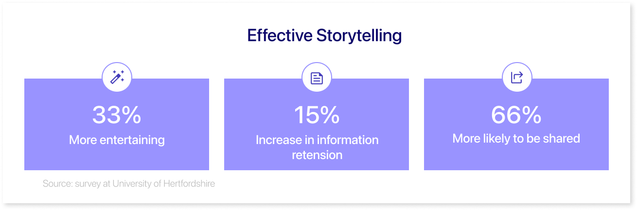
Personalized visualizations provide an opportunity to tell your brand's story in a visually compelling and coherent manner. By aligning your visual elements with your brand's look and feel, you can effectively convey your brand's values, narrative, and key messages. Consistent visual storytelling enhances brand recall and helps communicate your brand's unique identity and purpose.
Introducing Vizzly: A Powerful Tool for Customer-Facing Analytics
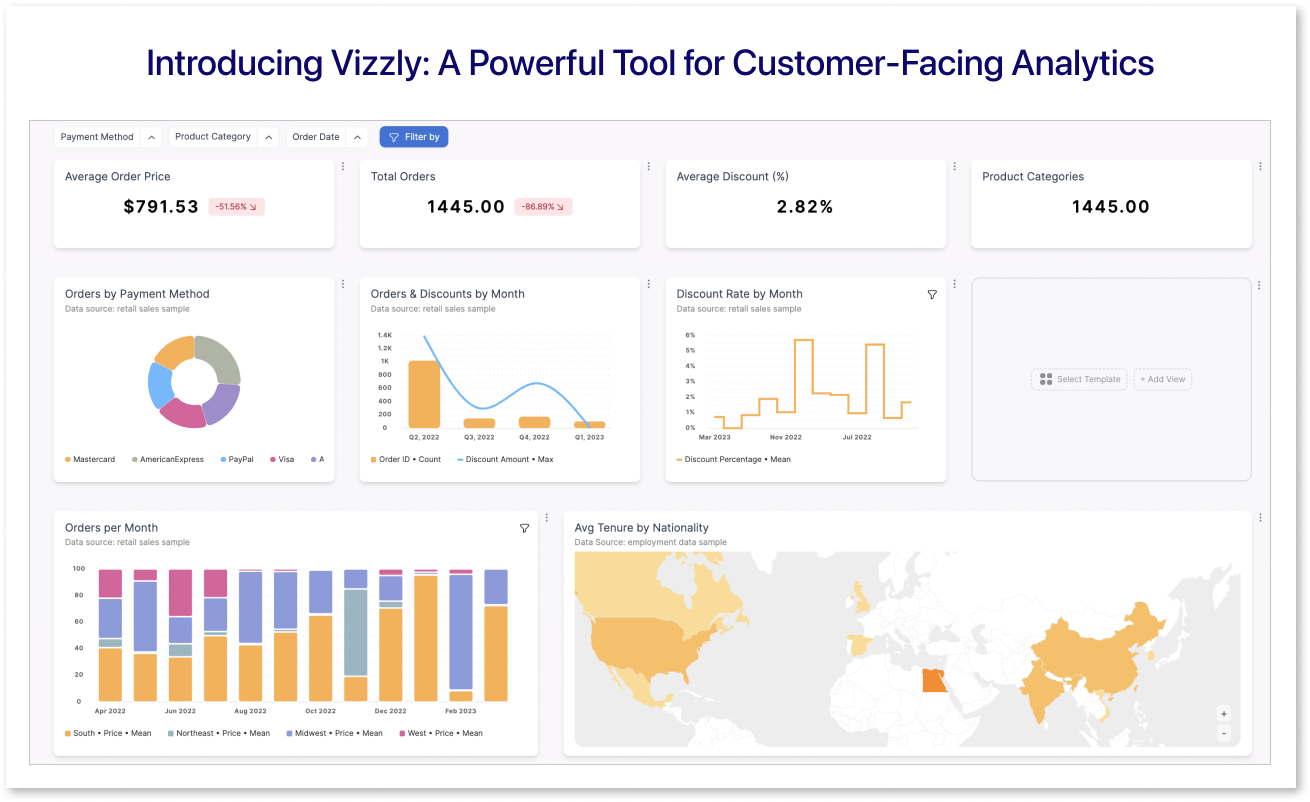
Vizzly is an embedded analytics tool that empowers users to create interactive and dynamic visualizations with ease. It combines the functionalities of data visualization and storytelling to enable users to present their data in an engaging and meaningful way. With Vizzly, users can connect their database in a self-hosted environment, their datasets, and explore various visualization options, including charts, tables, and soon maps. The platform offers a wide range of customization features; for example, you can pass CSS objects directly to the Vizzly Theme API to align with your user interface design system. This developer-friendly solution supports embedding as React or Vue components, not an iFrame in sight.
Moreover, Vizzly understands that each brand has its own set of specific requirements. Whether you're a small startup, a large corporation, or anything in between, Vizzly can be molded to fit your users' data requirements.
With Vizzly, customization goes beyond visuals. The company offers a user-friendly dashboard design development approach driven by an API. For instance, you can directly access their API through React hooks to create charts or dashboards. Moreover, the product is extensible with your own code, allowing you to inject custom components into your dashboard.
Leveraging Mokkup Designs for Customization
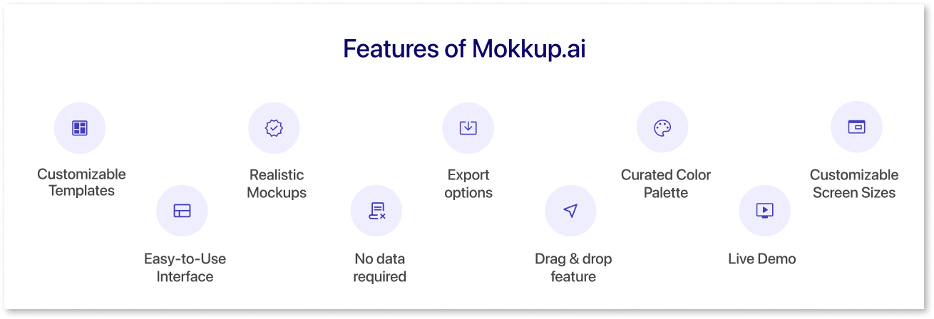
Using Mokkup designs as a starting point for customer-facing visualizations is a valuable and efficient approach in the world of design and branding. Mokkup designs, also known as mockups or wireframes, are essentially visual representations of an interactive dashboard, user-friendly design, or concept. They provide a realistic depiction of how the final product or wireframe will look, allowing designers, marketers, and clients to preview and evaluate the visual elements before investing significant time and resources.
One of the key benefits of using mokkup.ai is that it provides a tangible context for customers to visualize the result. Instead of relying solely on imagination or abstract descriptions, customers can see and experience how the product or design will look in a realistic setting. This visual representation enhances comprehension, enabling customers to provide more specific and valuable feedback. It also helps align expectations between designers and customers, minimizing misunderstandings and potential design revisions down the line.
Mokkup's pre-built templates offer several advantages regarding visual consistency and efficiency. Let's explore these:
1. Visual Consistency:
The templates can provide a solid foundation for achieving visual consistency throughout a project or brand. By creating mockups early in the design process, designers can establish and refine the visual elements that will be used consistently across various customer-facing materials. This includes user dashboard color palettes, branding elements, layout structures, and more. By maintaining consistency in these visual aspects, businesses can establish a strong and recognizable brand identity, which helps build trust and loyalty among customers.
2. Streamlined Design Process:
Mokkup's pre-built templates streamline the design process by allowing designers to present their ideas and concepts visually from the early stages. This visual representation serves as a reference point for all stakeholders involved in the project, ensuring a clear understanding of the design direction and objectives. By providing a tangible framework, these pre-built templates enable more efficient communication and decision-making, reducing the chances of misinterpretation or confusion.
3. Early Feedback and Iteration:
Mokkup.ai's pre-built templates facilitate early feedback and iteration, which is essential for refining the visual aspects of customer-facing materials. By sharing mockups with clients or customers, designers can gather valuable input and insights. This feedback allows for necessary adjustments and revisions, ensuring that the final visualizations align with the expectations and preferences of the target audience. Early iteration based on mockup designs saves time and effort, enabling designers to make adjustments before investing significant resources in the development of the final product.
4. Time and Cost Efficiency:
Mokkup leverages design thinking to allow developers to be designers as well. This eliminates the need for a company to hire a specific design team, thus saving money. Time is saved because developers can quickly draft up their wireframes while understanding what is possible to do with the data
Customer-Facing Dashboard Best Practices
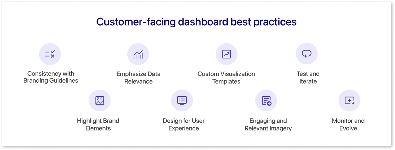
When it comes to customizing and branding customer-facing visualizations, here are some best practices to consider:
- Consistency with Branding Guidelines: Ensure that your customer-facing visualizations adhere to your branding guidelines. Use consistent primary colors, typography, logo placement, and other visual elements that align with your brand identity. Consistency builds brand recognition and strengthens the overall customer experience.
- Highlight Brand Elements: Incorporate your brand elements strategically within the visualizations. This includes placing your logo in a visible location, using your brand colors in charts or graphs, and applying your brand fonts consistently. Make sure these elements are seamlessly integrated without overpowering the data or visuals.
- Emphasize Data Relevance: While branding is important, it's crucial to maintain a focus on the data being presented. Ensure that your customization choices enhance data readability and comprehension. Use user-friendly colors, fonts, and visual cues to highlight key insights and guide the viewer's attention effectively.
- Design for User Experience: Prioritize user experience when customizing customer-facing visualizations. Consider the needs and preferences of your target audience. Create intuitive navigation, clear labeling, and interactive features that enhance engagement and understanding. Strive for simplicity, clarity, and ease of use.
- Custom Visualization Templates: Develop custom visualization templates that align with your brand's aesthetics and data presentation needs. These templates can include predefined chart styles, color palettes, and typography choices that are consistent with your brand. Custom-free dashboard templates help maintain a consistent look and feel across various visualizations. You can also use mokkup.ai's pre-built templates to meet these requirements.
- Engaging and Relevant Imagery: Incorporate high-quality and relevant imagery that complements your brand and the presented data. Choose images that evoke emotions, align with your brand values, and resonate with your target audience. Ensure that the imagery supports and enhances the overall message and narrative.
- Test and Iterate: Regularly test your customized visualizations with a sample of your target audience. Gather feedback and iterate based on their preferences and needs. Testing helps identify areas for improvement and ensures that your visualizations effectively communicate your brand and data.
- Monitor and Evolve: Continuously monitor the performance and effectiveness of your customized visualizations. Track engagement metrics, user feedback, and conversion rates. Stay updated with design trends, industry standards, and customer expectations to evolve and adapt your visualizations accordingly.
By following these best practices, you can effectively customize and brand customer-facing visualizations, creating a consistent, engaging, and impactful experience that aligns with your brand identity and resonates with your customers.
The Ability to Bring Balance Between Customization & Usability
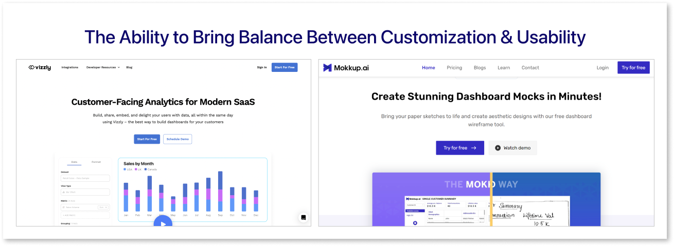
Maintaining a balance between customization and usability is paramount when using tools like Vizzly and Mokkup. Mokkup.ai allows users to customize their visualizations and mock designs to align with their needs and brand identity. Customization allows users to tailor the visuals, incorporating personalized elements that resonate with their target audience. However, it is crucial to ensure that customization does not compromise usability. Vizzly remains intuitive and user-friendly, enabling individuals with varying levels of technical expertise to navigate and create visually appealing outputs effortlessly. Striking the right balance ensures that users can harness the power of customization while maintaining a seamless and efficient workflow. Ultimately, the combination of customization and usability in Vizzly and Mokkup empowers users to create visually compelling and user-centric dashboards that effectively communicate their message.
Conclusion
In conclusion, combining customization and branding can significantly elevate customer-facing visualizations, and Vizzly proves to be an excellent dashboard wireframe tool for achieving this goal. By leveraging the customization features of Mokkup & Vizzly, users can tailor their visualizations to align with their brand identity, incorporating company logos and design elements that resonate with their target audience. The ability to showcase data in a visually compelling and brand-aligned manner can leave a lasting impression on customers, effectively conveying information and insights in a way that is engaging and memorable. Start leveraging the customization features of this data visualization tool today to enhance the user experience, strengthen brand loyalty, and make a lasting impression on your customers.
Prompt it. Wireframe it with Mokkup.ai.
